
Uni Project
This was a fun packaging design project that allowed me to explore a wide range of design options and improve my practical artworking skills, where I could also experiment with materiality.
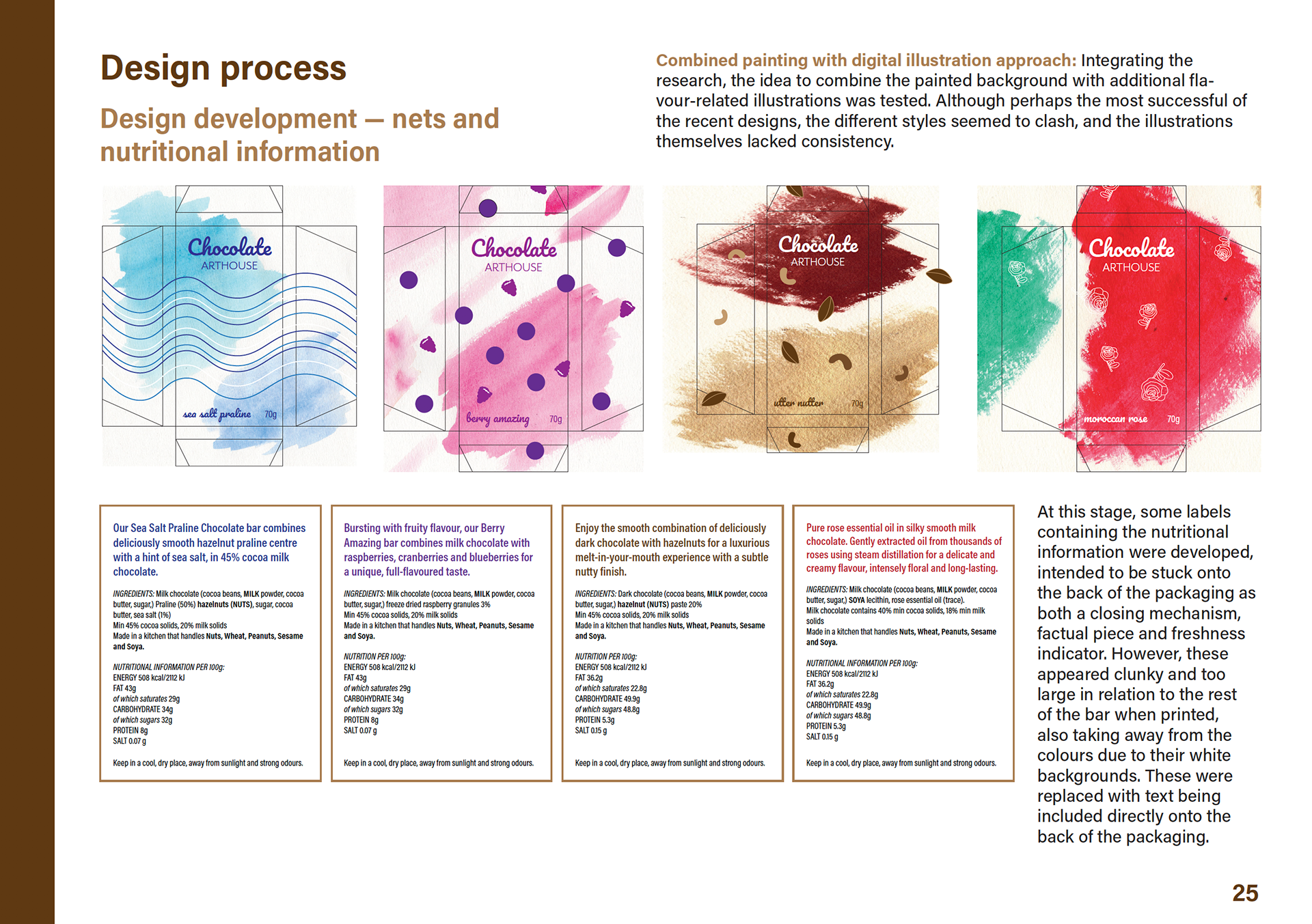
Taking inspiration from the brand name, the new packaging for "Chocolate Arthouse" bars and selection box features textured shapes consisting of the ingredients printed on mixed media art paper. For example, the "Berry amazing" bar textures are made up of crushed raspberries and blackberries, interspersed with triangles of melted chocolate, whilst the "Sea salt praline" flavour features watercolours sprinkled with salt.
In addition to the physical packaging, the branding was extended to advertising and online presence, showcasing the new flavours. My inspiration for this project can be viewed via my Behance mood board.
This is a theoretical project, the real branding for "Chocolate Arthouse" can be viewed here.


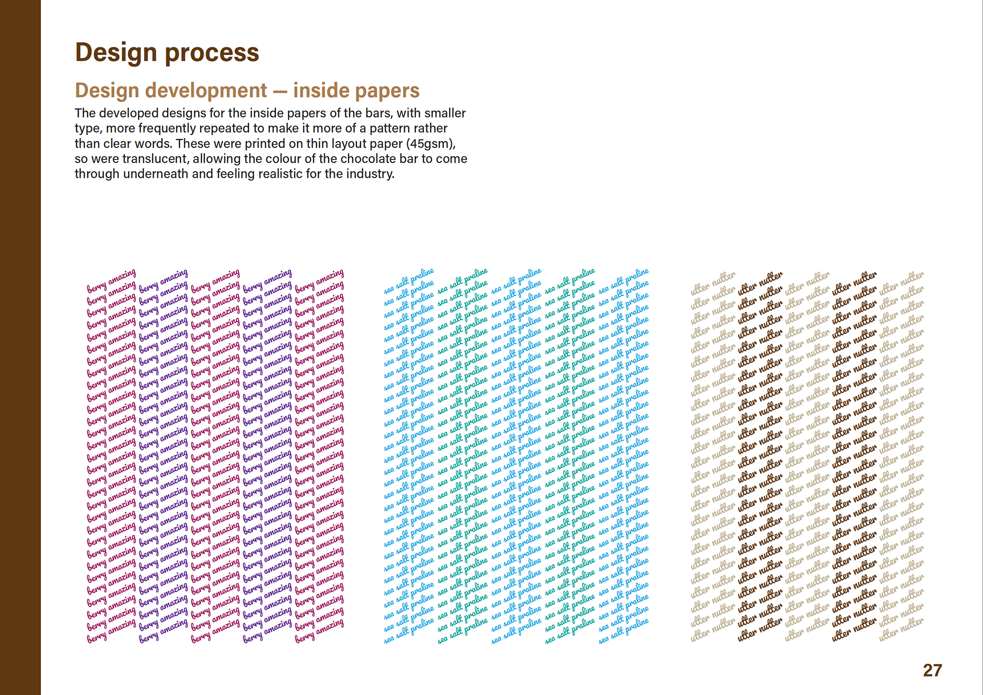
Chocolate bars // images showcasing the inside of the bars which featured more of the coloured textures and additional thinner papers to aid the user journey and ensure freshness.


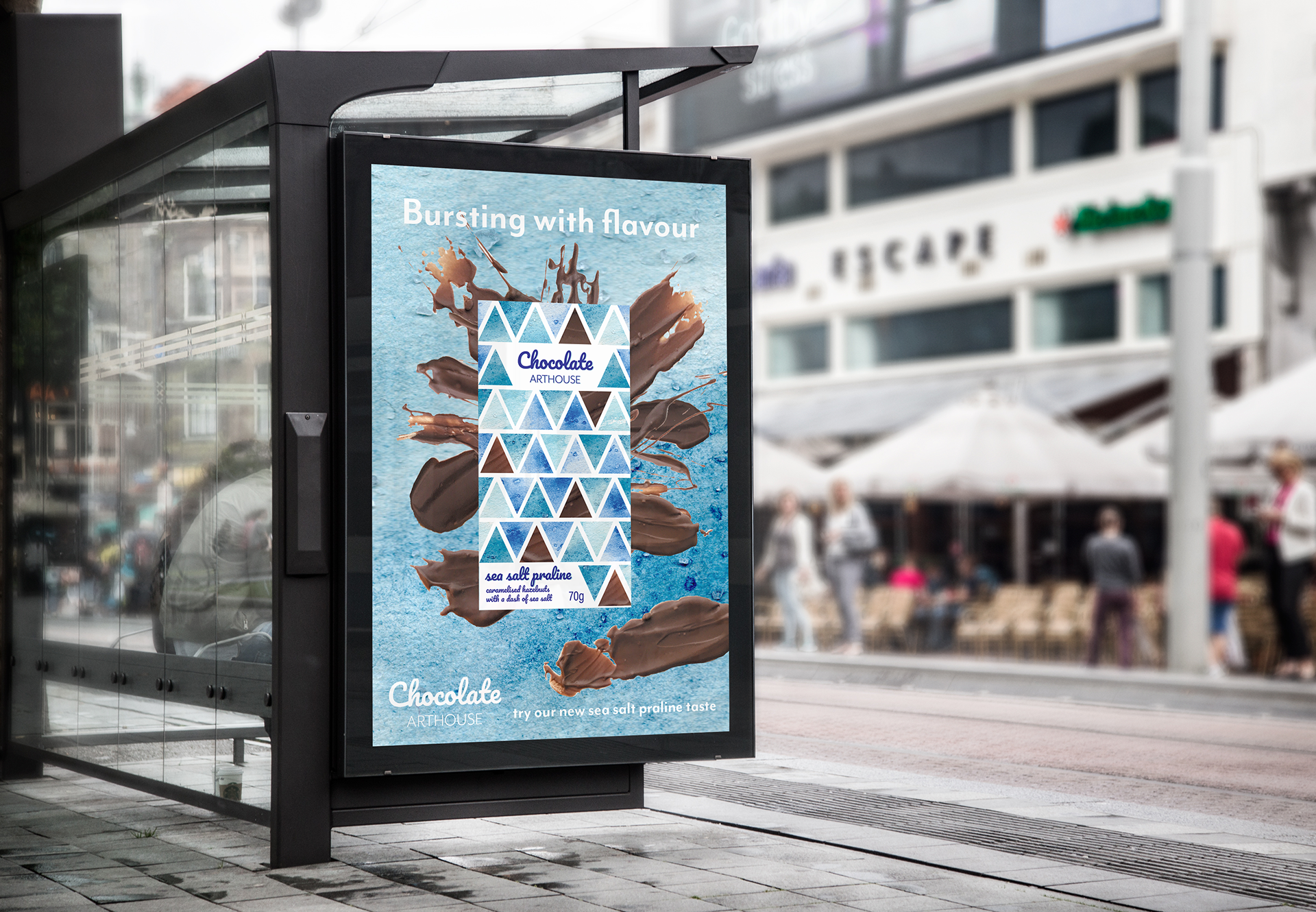
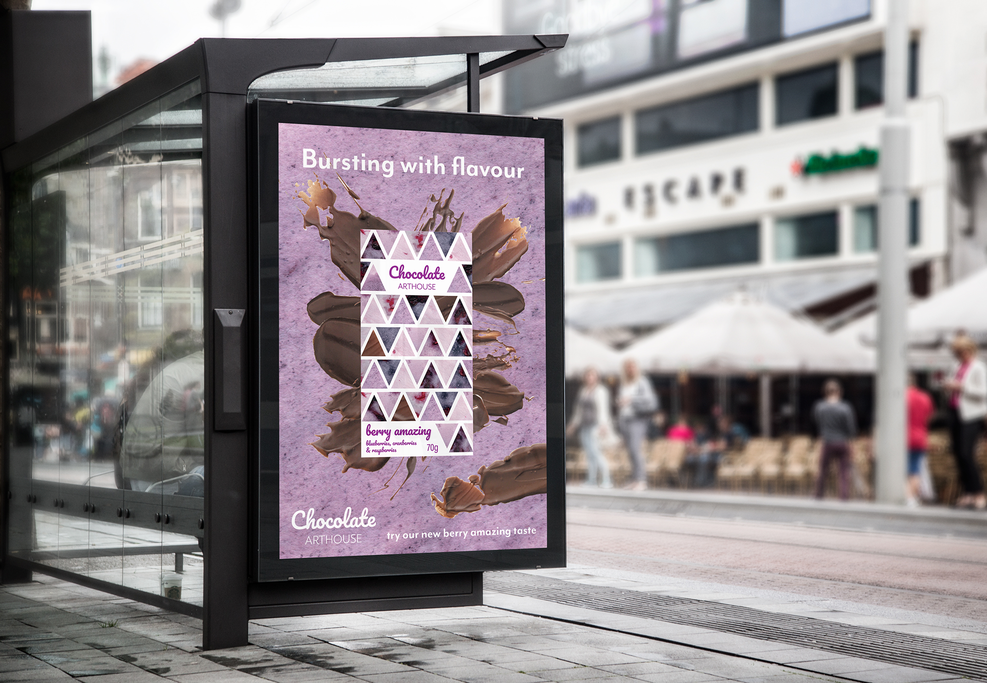
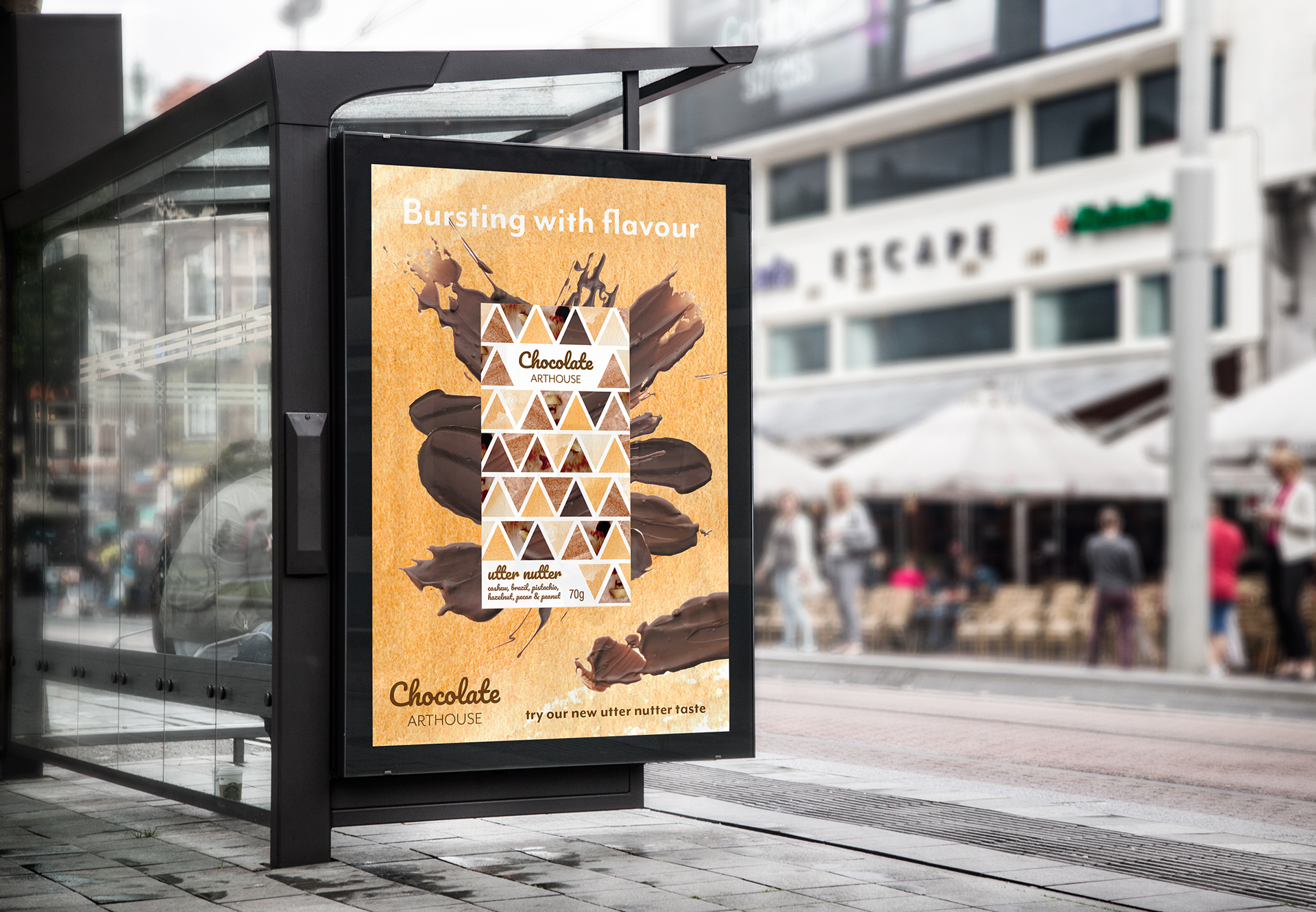
Advertising // branded billboards to accompany the launch of the new packaging.
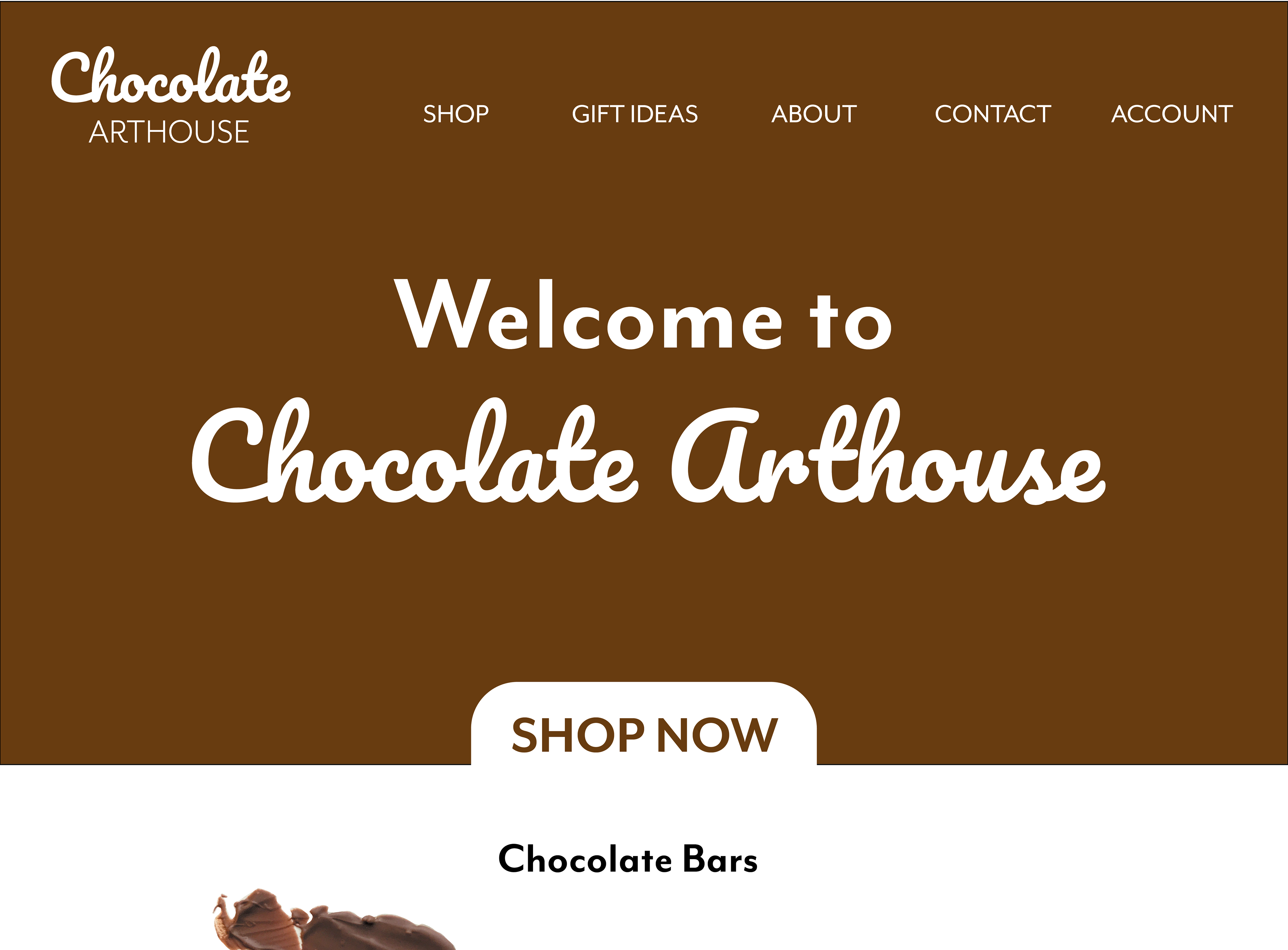
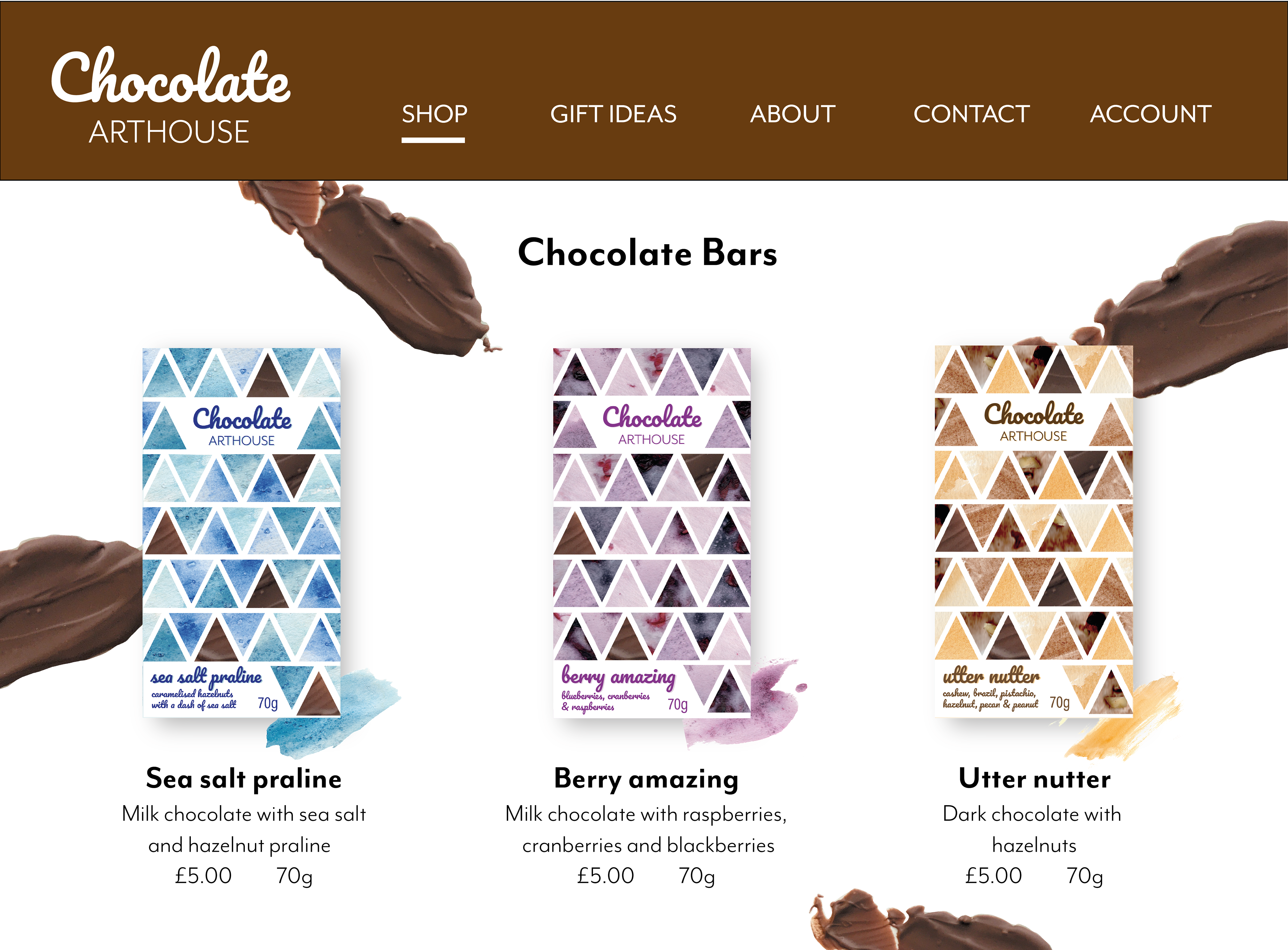
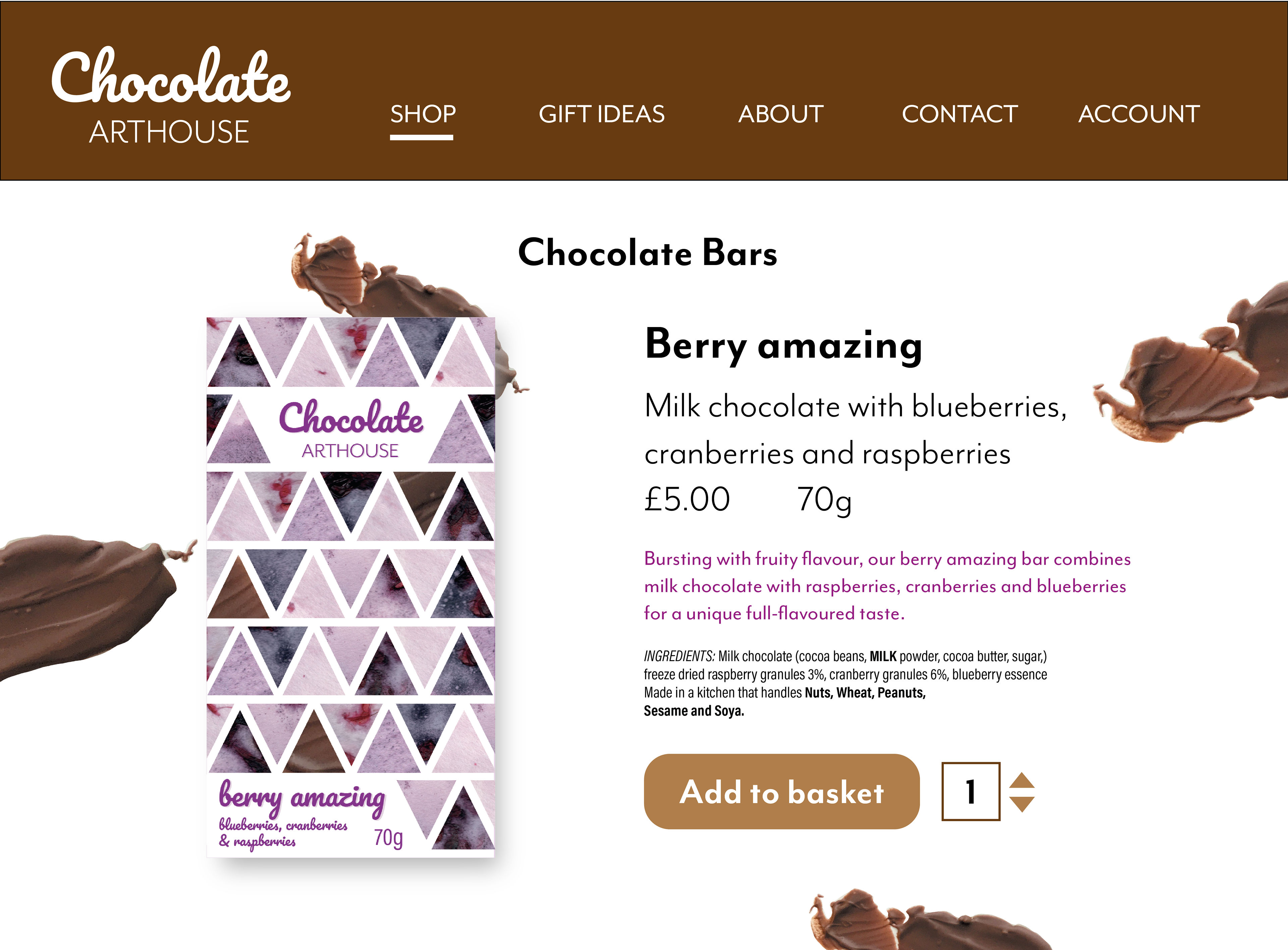
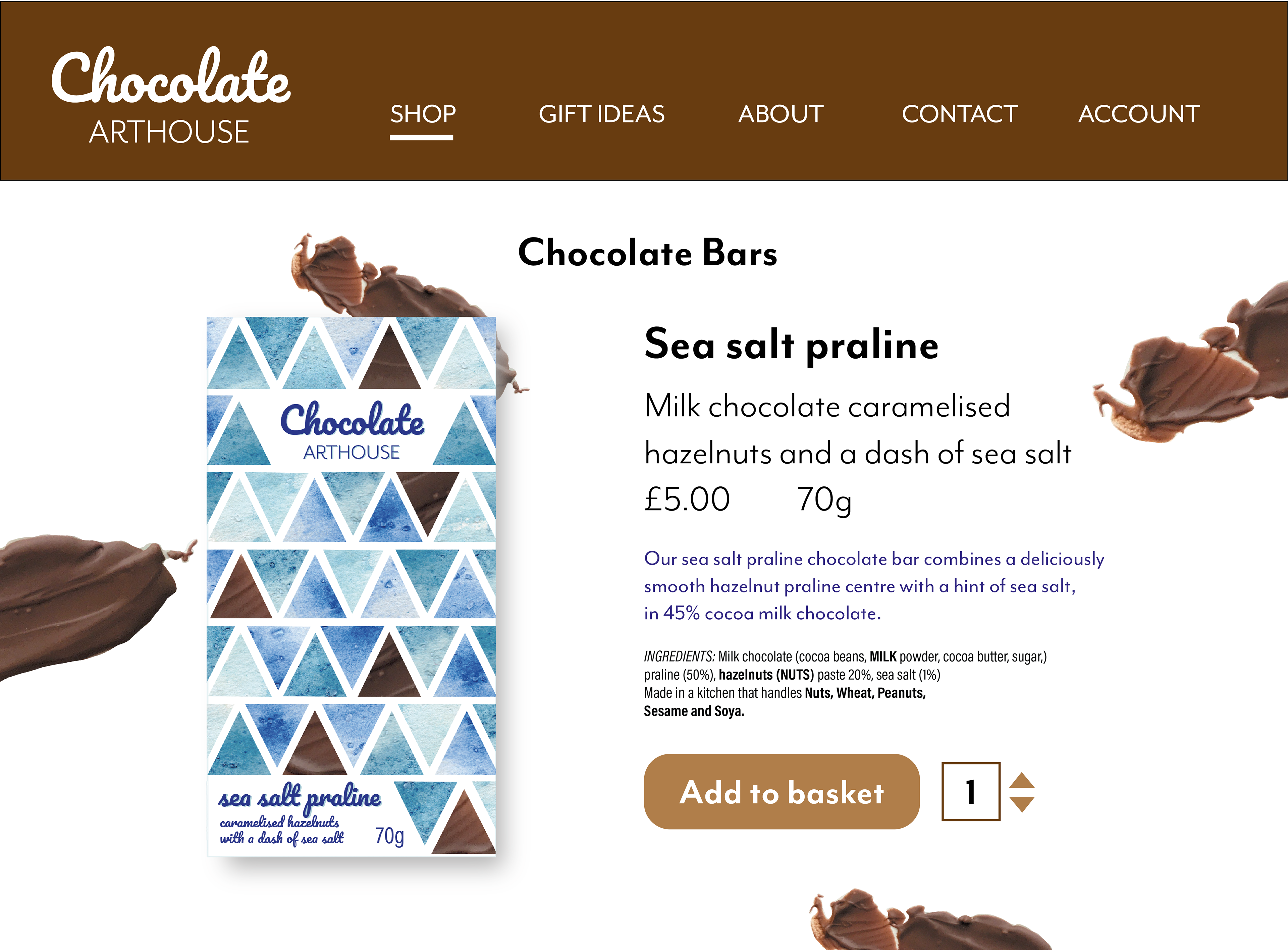
Online presence // website concept for the brand.
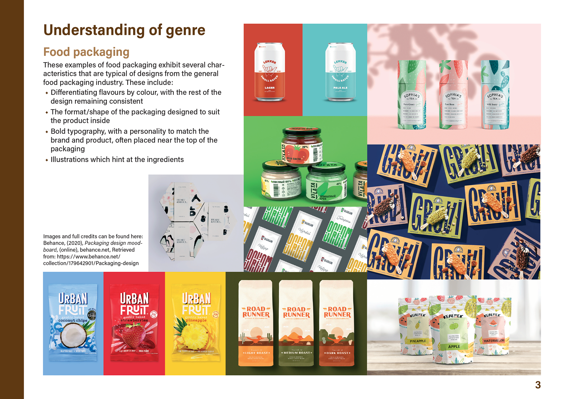

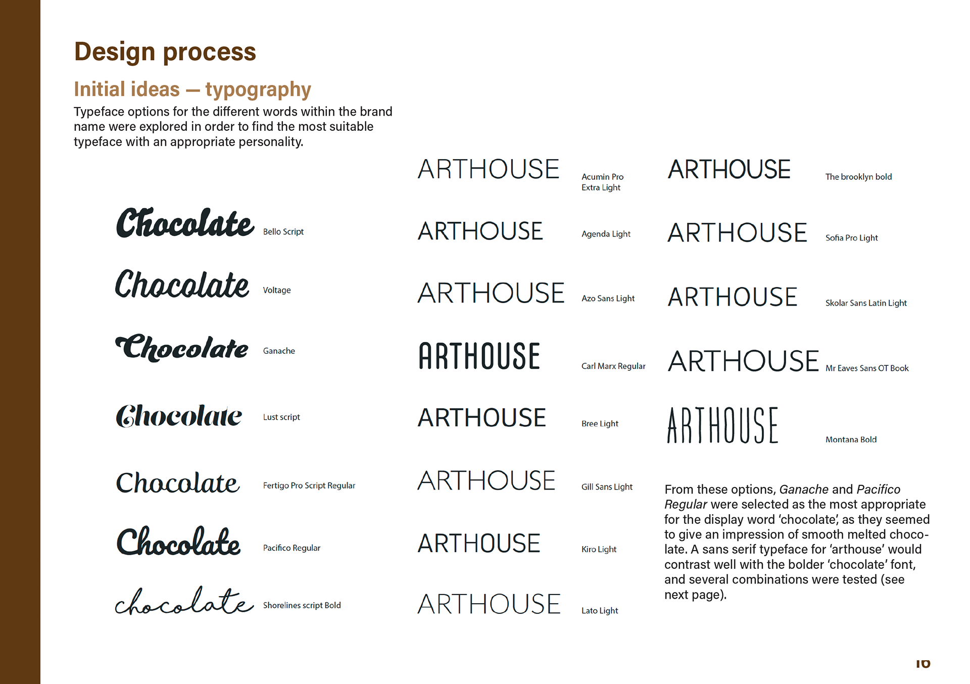
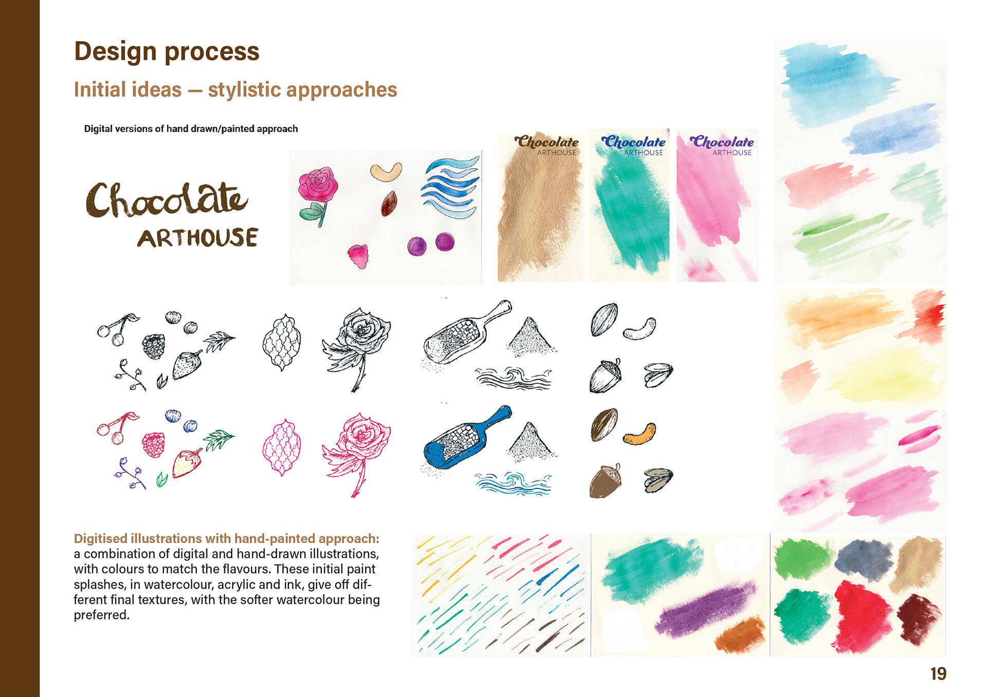


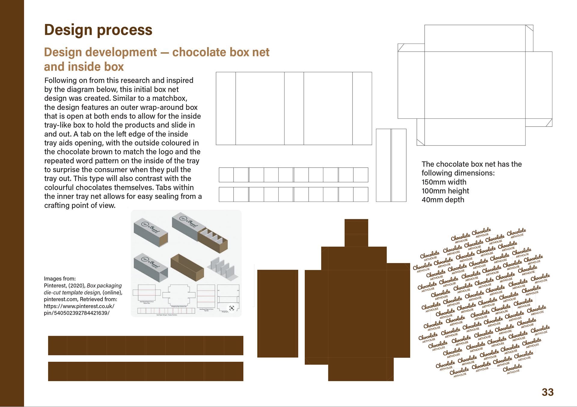
Design development // some of the pages from an accompanying report for this project detailing research and design development.