
Uni Project
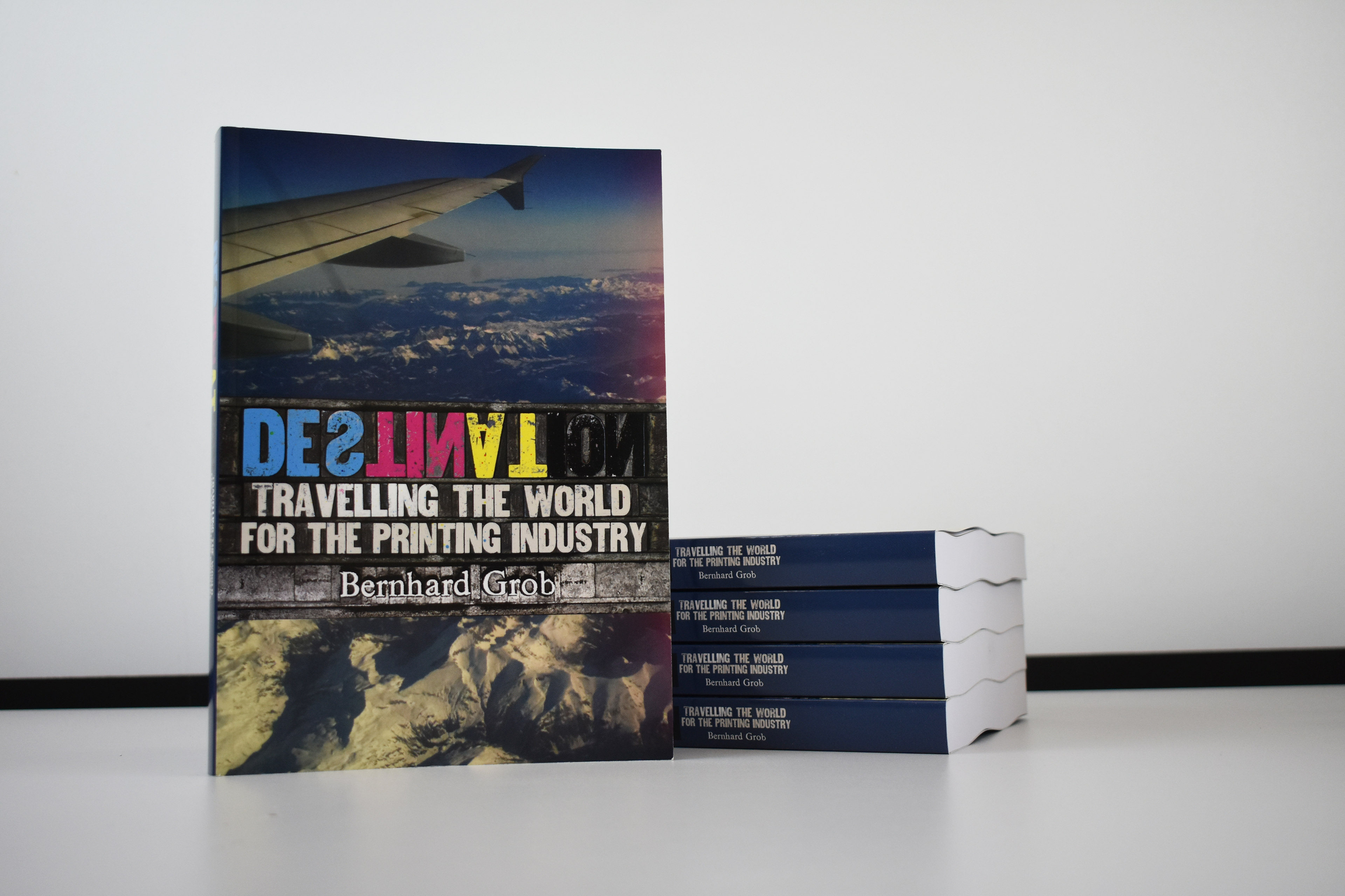
Over the last thirty years in the label and packaging printing industry, Swiss-born Bernhard Grob has travelled across the world to promote and sell flexography printing presses for the company Edale Ltd. of which he was a co-owner and Managing Director. During these travels, Grob has written a series of annual travel journals, detailing his experiences, the developments and any issues in the printing industry that he came across, now collated into his book; ‘Destination: Travelling the world for the printing industry.’
Grob enlisted me as part of the "Real Jobs" scheme at the University of Reading to design the inside pages of his book, with the main aim of producing a consistent layout appropriate to the content. This would involve proofreading, editing and typesetting the text, and sorting, editing and arranging corresponding imagery. Clarity needed to be achieved, whilst also ensuring that the book remained engaging and interesting. The client stated that they were aiming for this project to be ‘something that is not the norm, something that is different to everything else on the bookshelf, something unique’ and hoped that, as a student designer, I would be able to expand my knowledge of the subject matter whilst also bringing a more youthful and on-trend approach to the design.
I also had an input on the design of the cover, although this was primarily designed by professional designer Richard Jones. Leading digital printers Xeikon produced the final printed sheets, which were then sent to Mueller Martini in Switzerland to be bound. One thousand copies of the book were produced in total, with five hundred being kept by the companies to demonstrate their machinery.
Overall, although a long and sometimes challenging process, the actual designing of the book was interesting and fun, especially as the use of colour in the text was encouraged, something unexpected and different to other books I have designed. Organisational skills were a must-have for this project given the large quantity of copy provided, alongside effective editing and selection skills, which I was able to develop. I am grateful to have had the opportunity to work on such an international project, with the production, promotion and distribution of the book involving many countries. Receiving copies of the final book was a really satisfying experience, it felt like a great achievement to have produced a physical item in a year of Covid where digital deliverables had been prioritised.
The book was not available for sale, but rather donations to the Typography Department at the University of Reading were encouraged, and I was pleased to see Bernhard return to present the Department with a cheque for £1,500 to go towards a student design fund. I continue to be in contact with Bernhard, who has been very supportive of my graphic design journey, and to whom I am very grateful for the 'real world' experience he provided in my final year of university.


Client reflection
"Dealing with Ruth throughout the lengthy process was a great pleasure and I much appreciated her professional punctuality, accuracy and attention to detail; something I considered rare in a final year student at university, eager to enter the real business world. Her keen creativity and understanding of the author’s mind-set played a key part in completing the design in such a short period of time, leading to the finished file, ready to go to the digital printing press manufacturer for printing. The only negative outcome is that the planned live book production during Drupa 2021 at the digital press manufacturer’s stand was unable to happen due to Covid.
In conclusion, I can highly commend Ruth as an excellent designer with an understanding for the bigger picture. A competent, driven young person with ambition who can lead from the front in the interests of the customer. I am sure she will go a long way in her future career making full use of her skills and entrepreneurial spirit.” — Bernhard Grob, BMGrob Consulting
If you are interested in receiving a copy of the book please contact bernhardgrob.destination@gmail.com.

Meeting the client // Bernhard handing over my copy of the final book at the University of Reading.
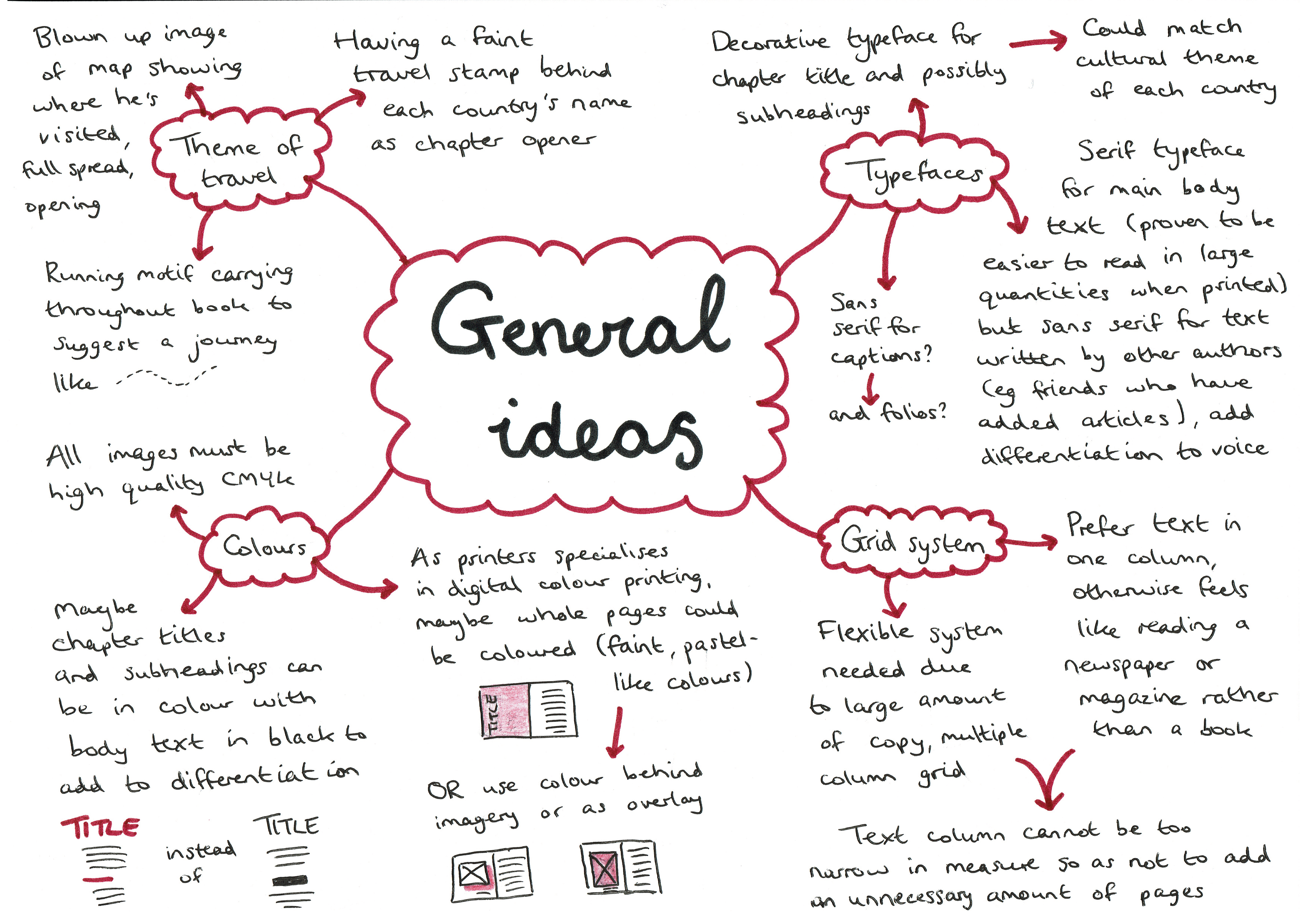
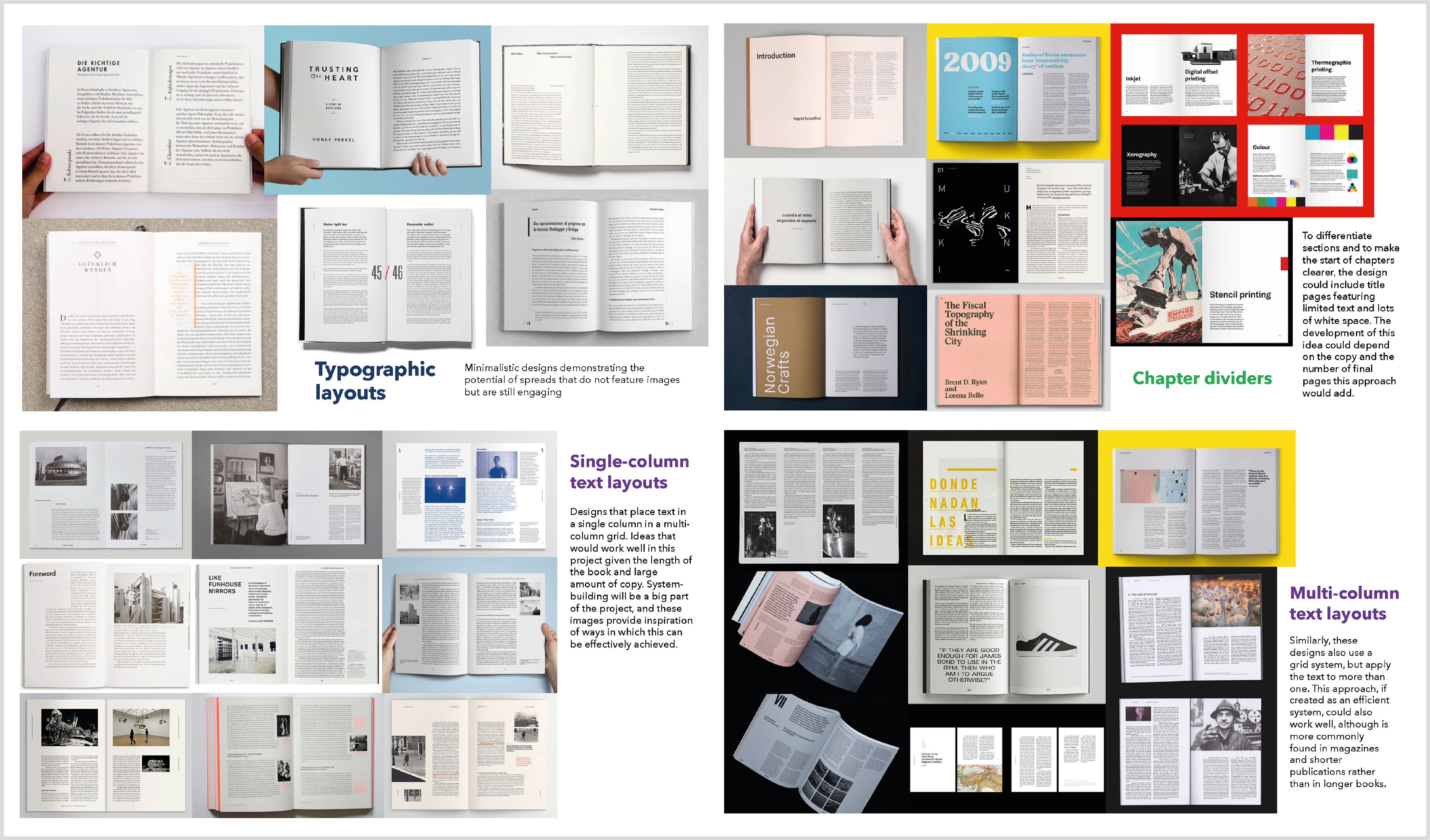
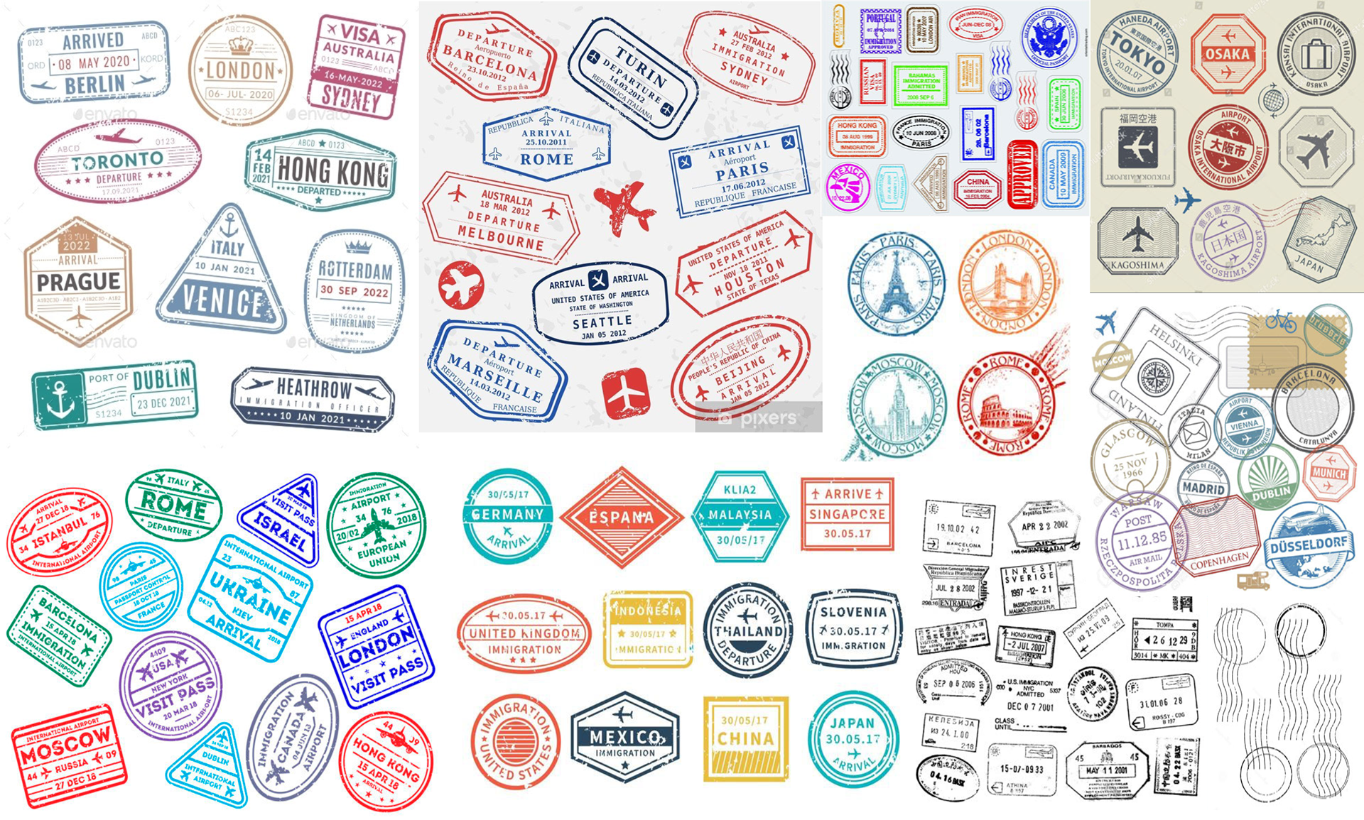
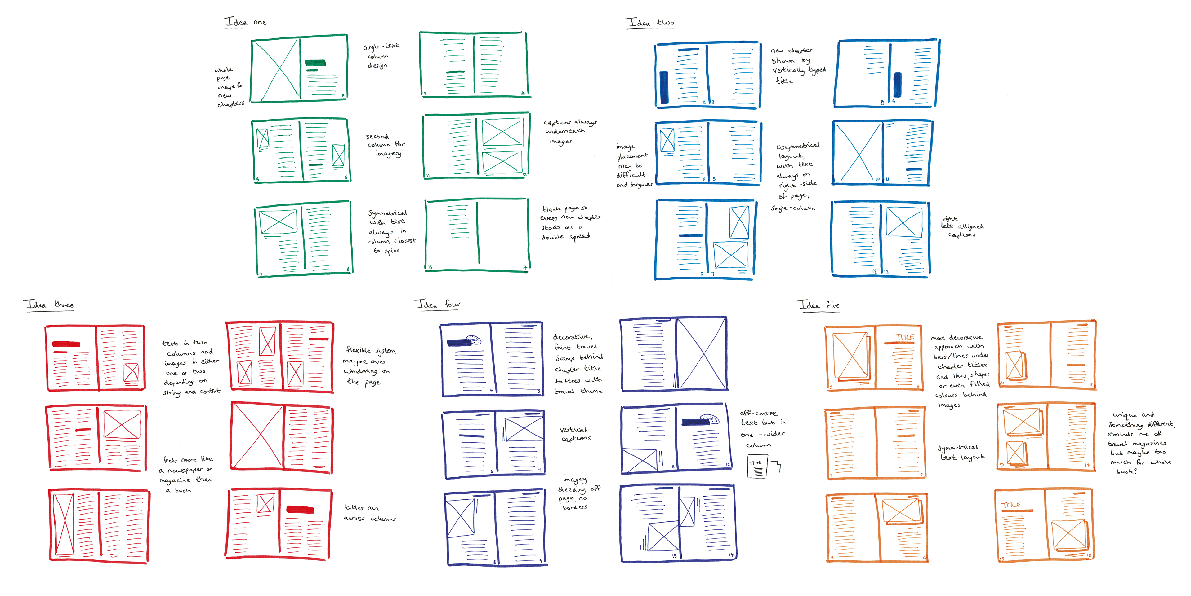
Below are some images detailing the project development, from initial research, to sketches, digital iterations and further developments experimenting with typographic layouts and the use of colour.

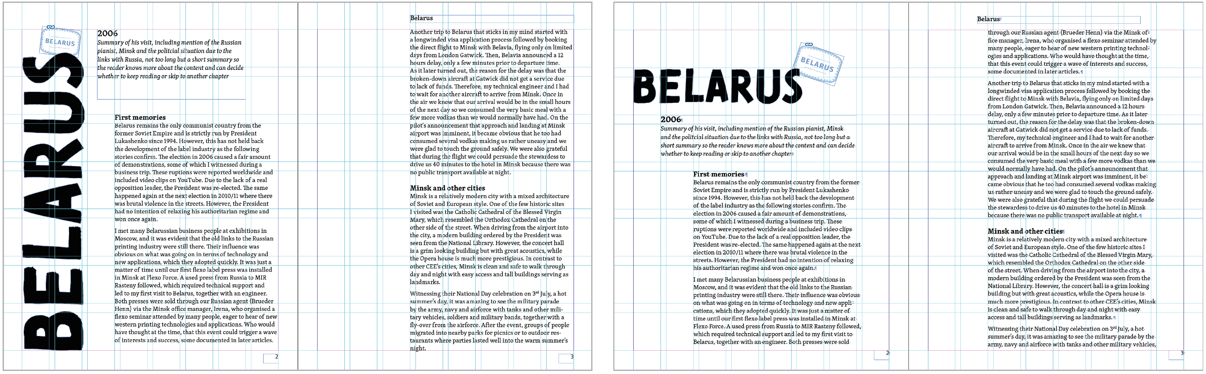
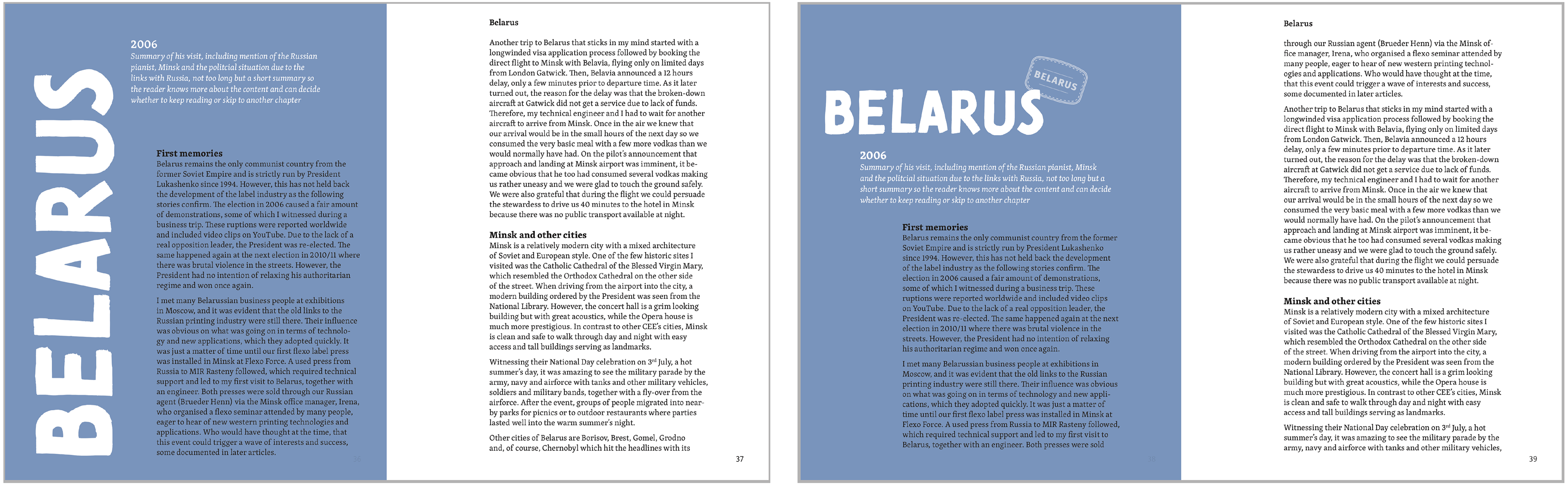
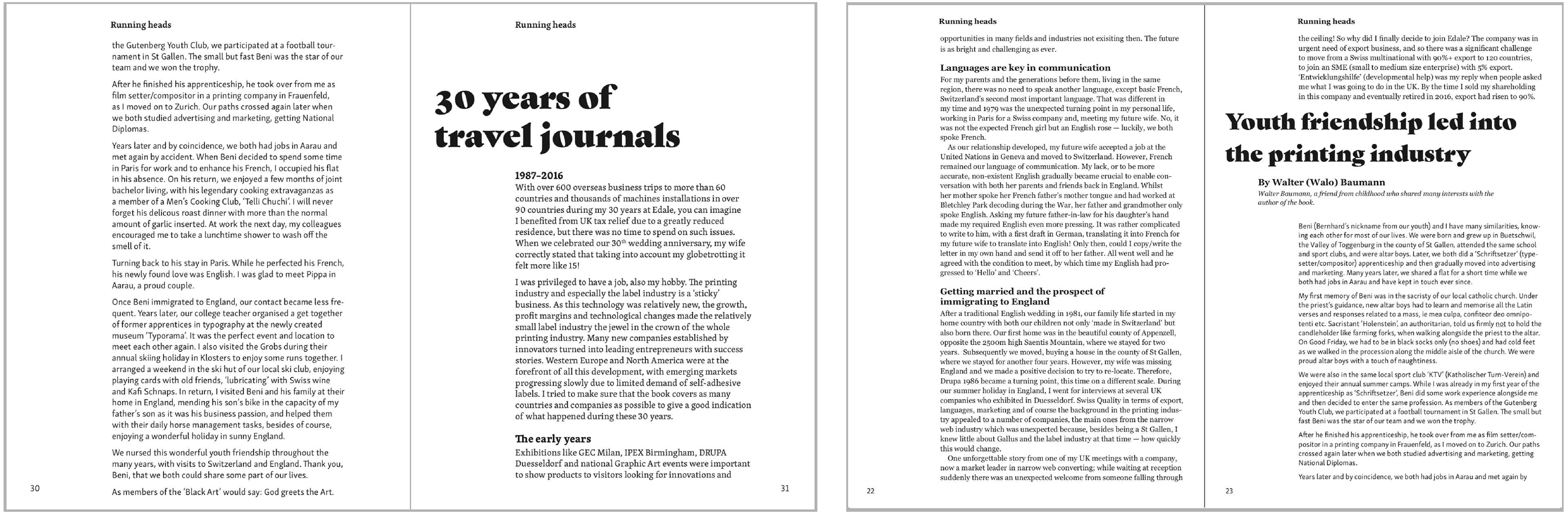
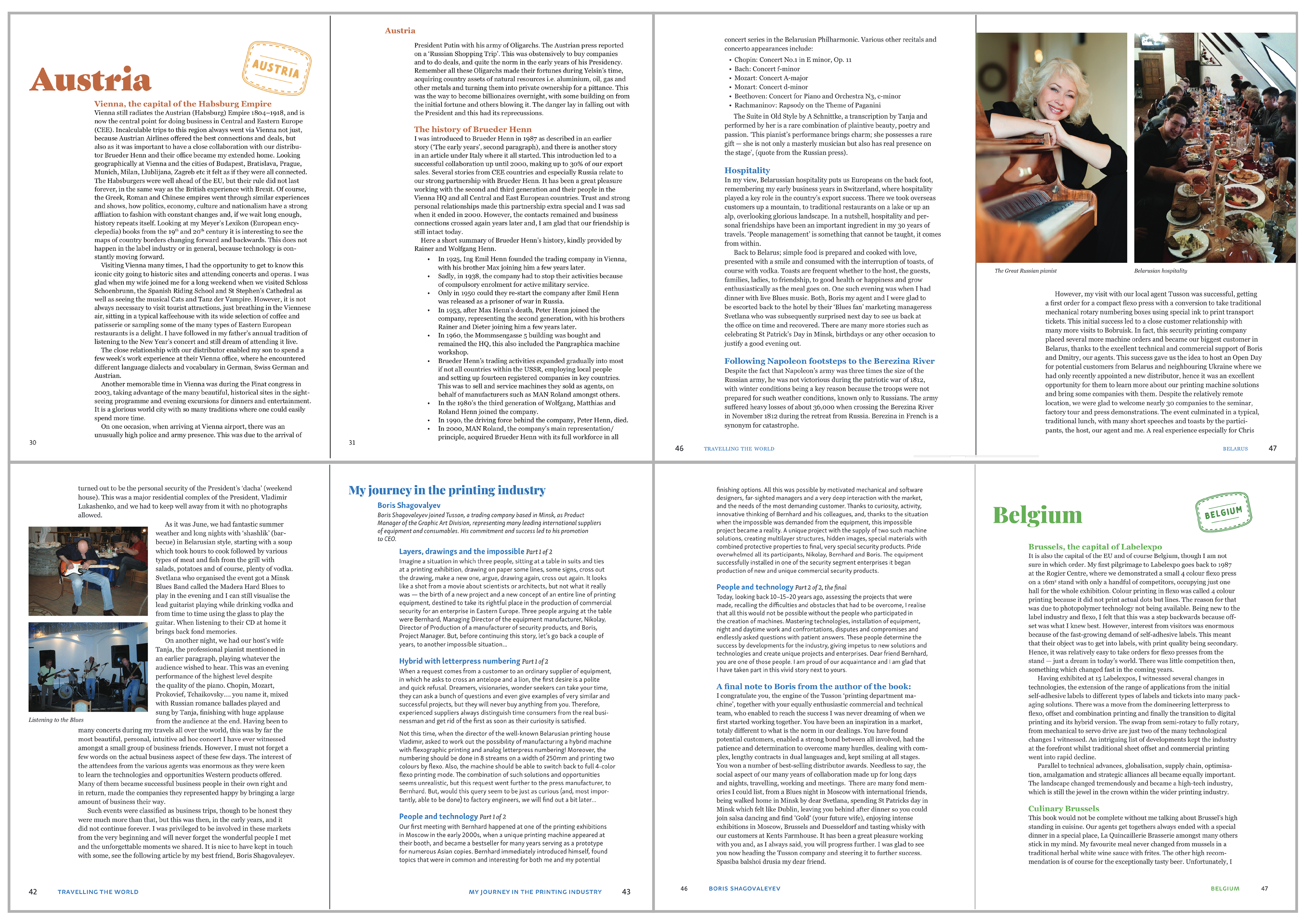
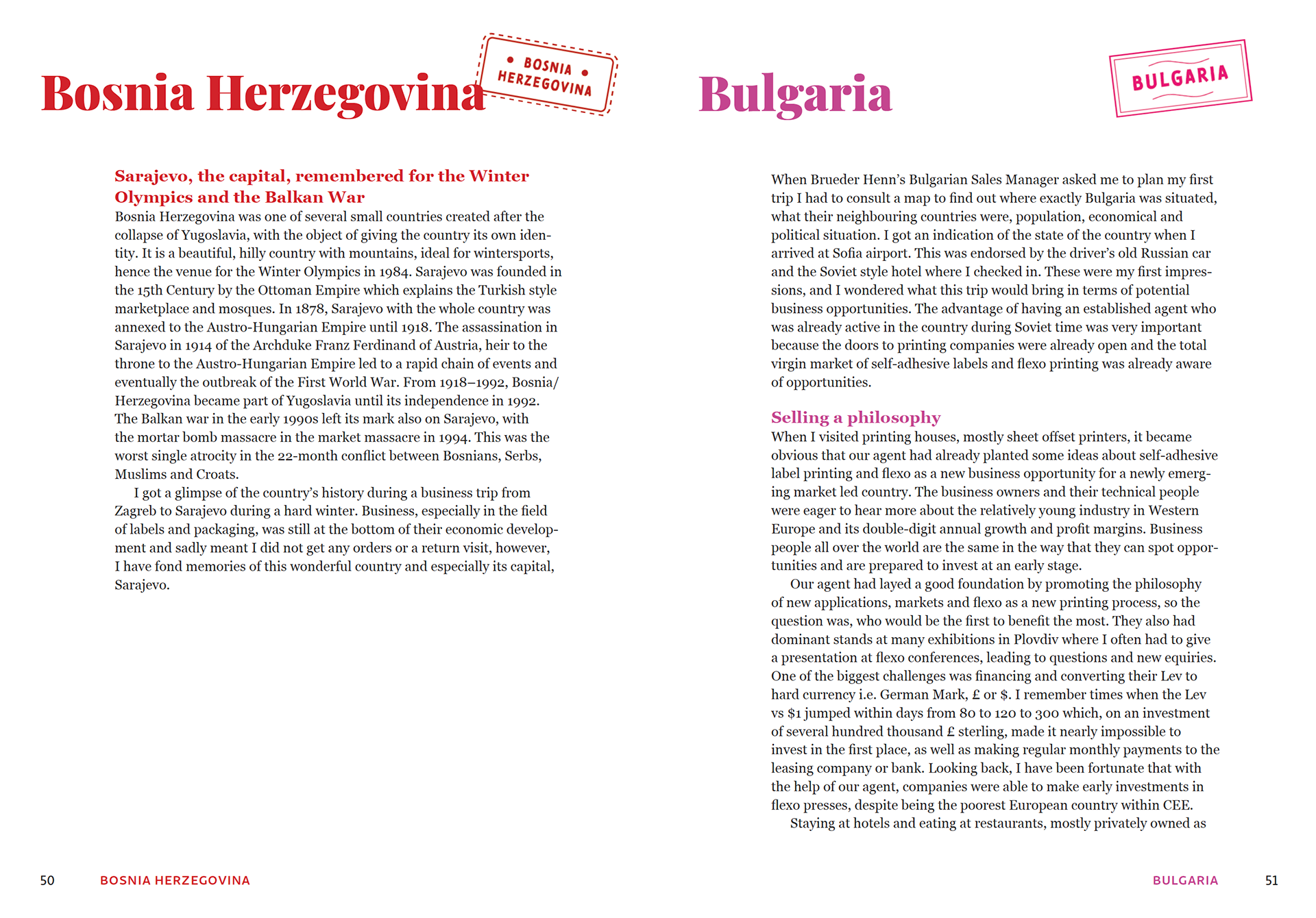
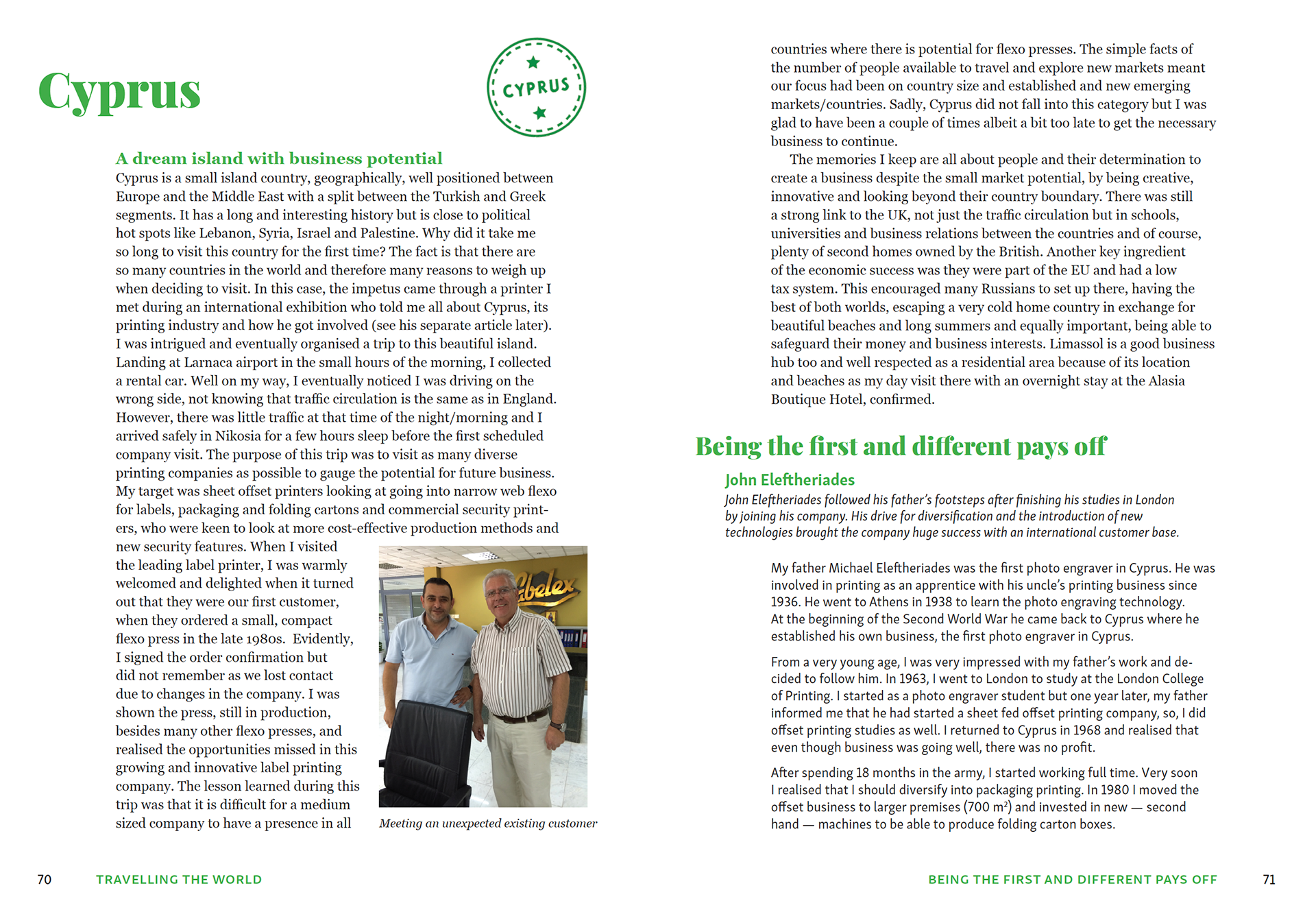

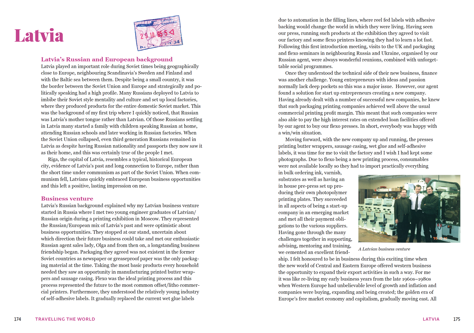
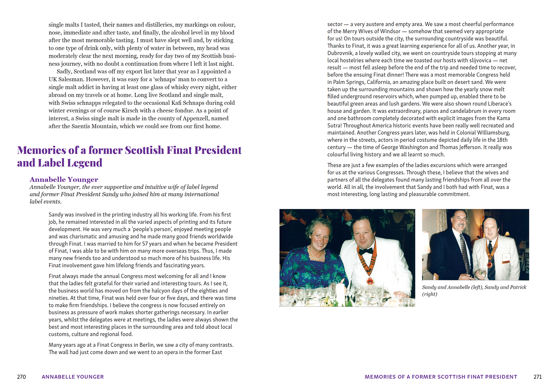
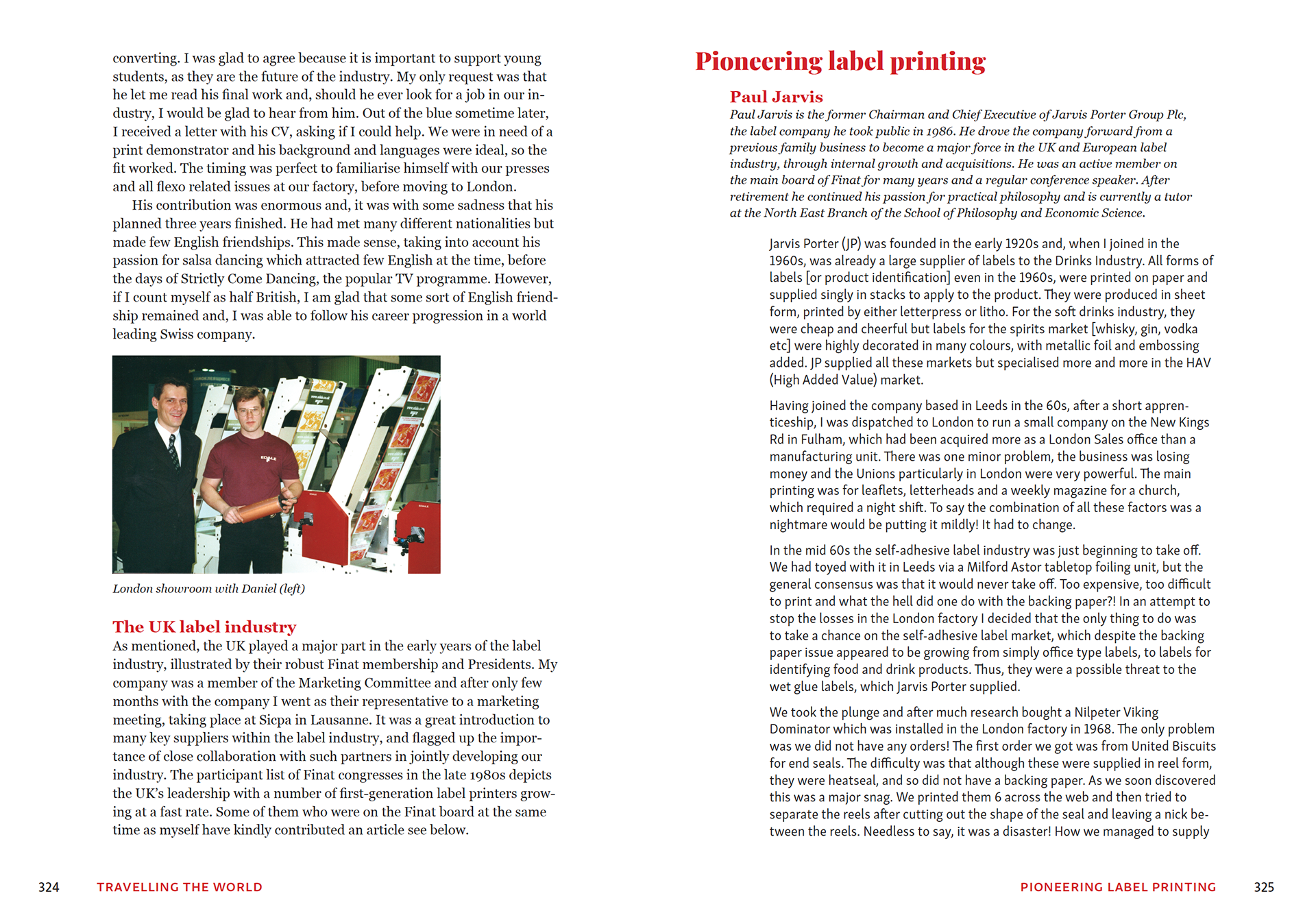
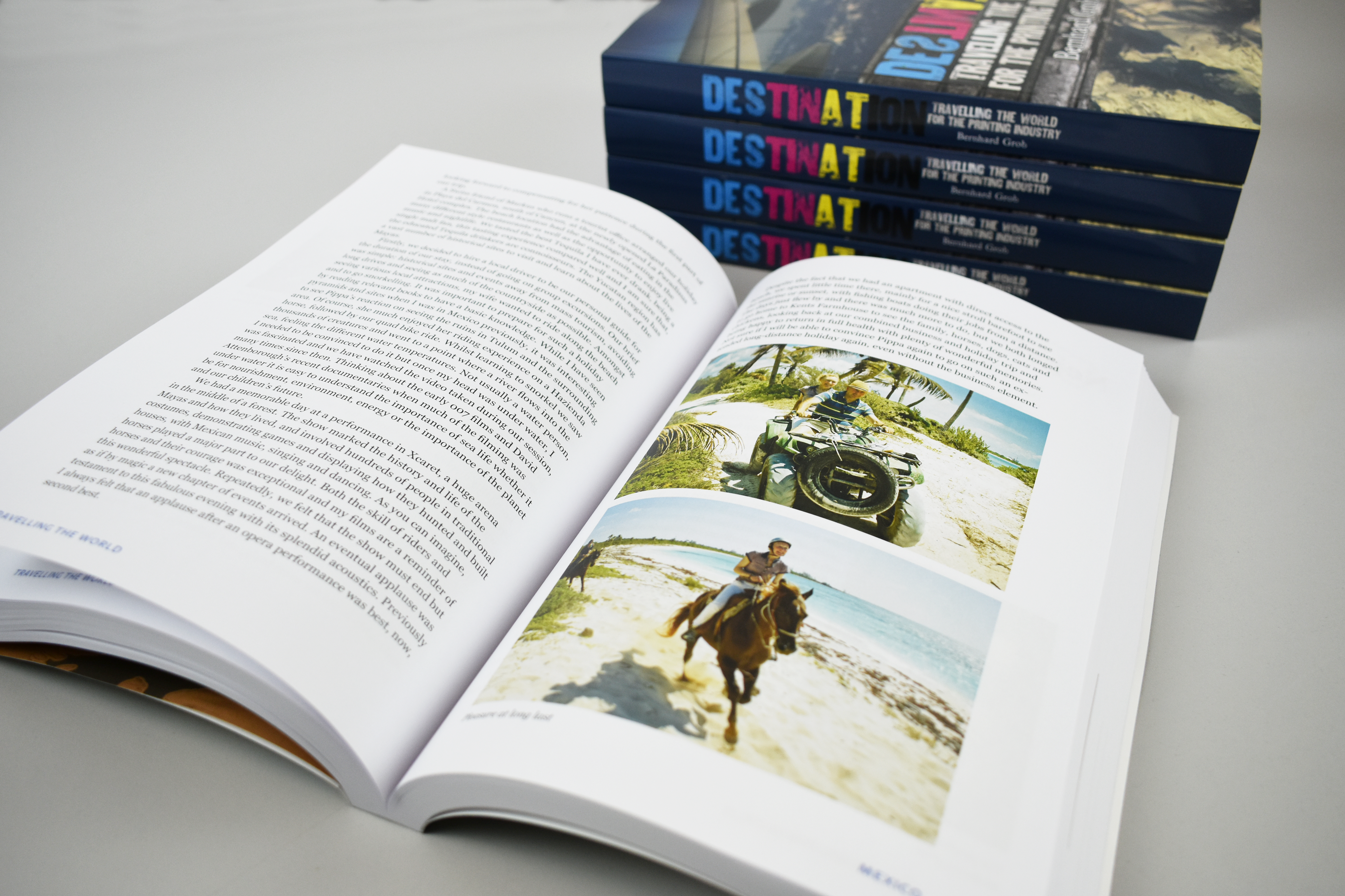
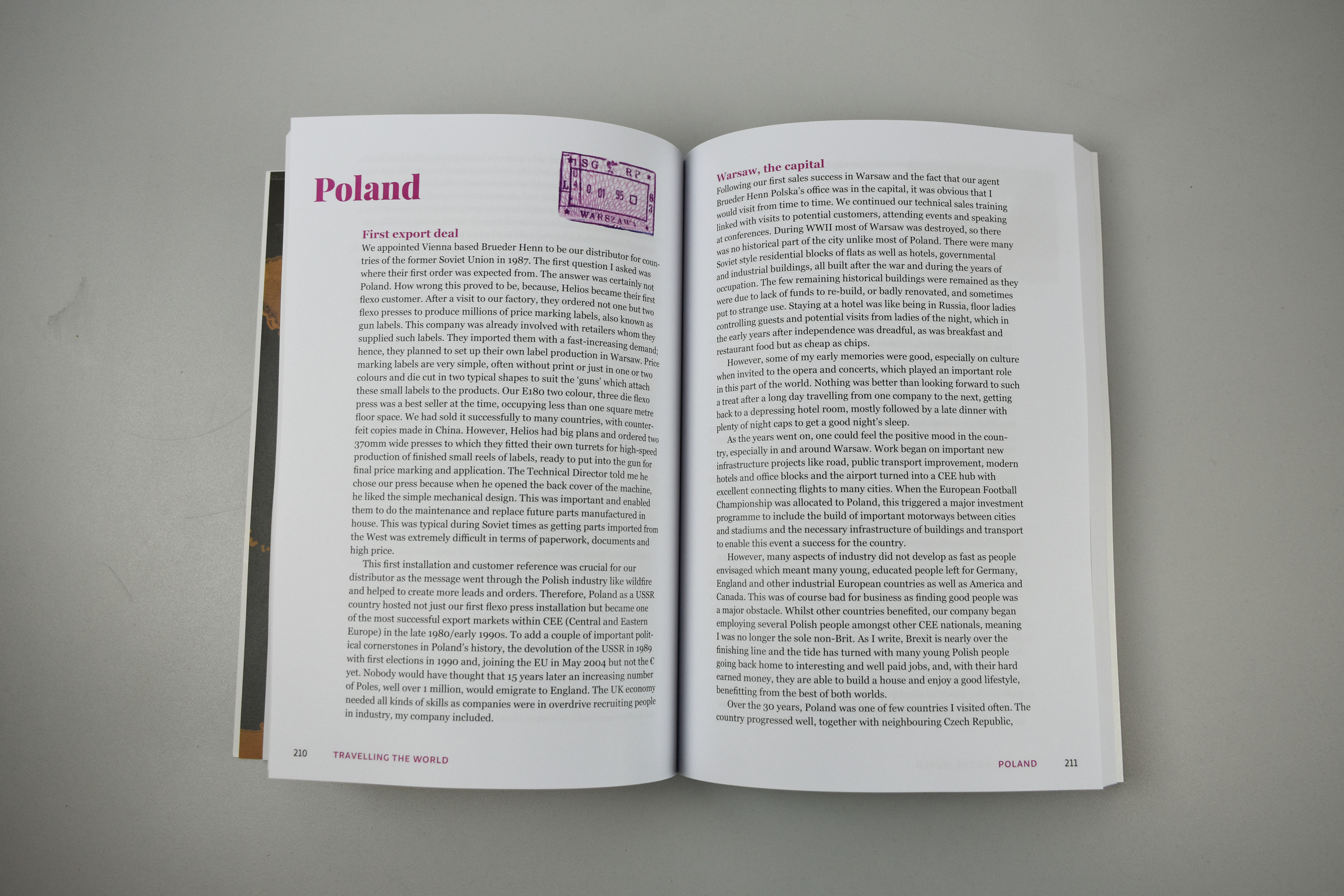
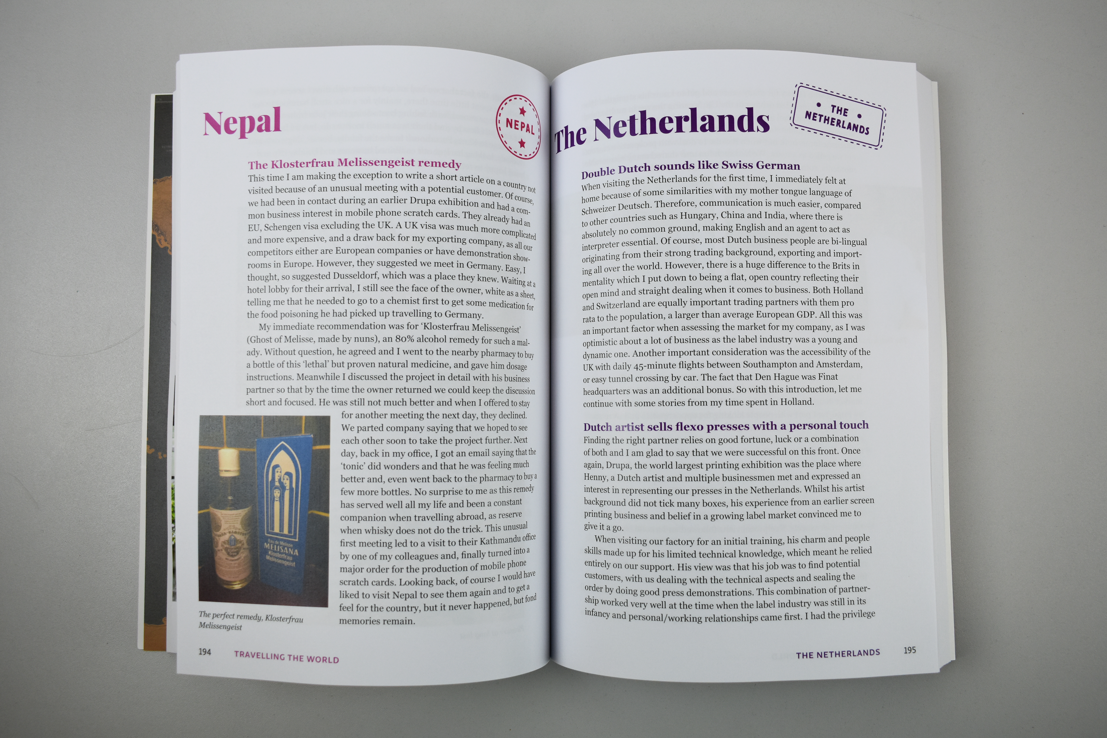
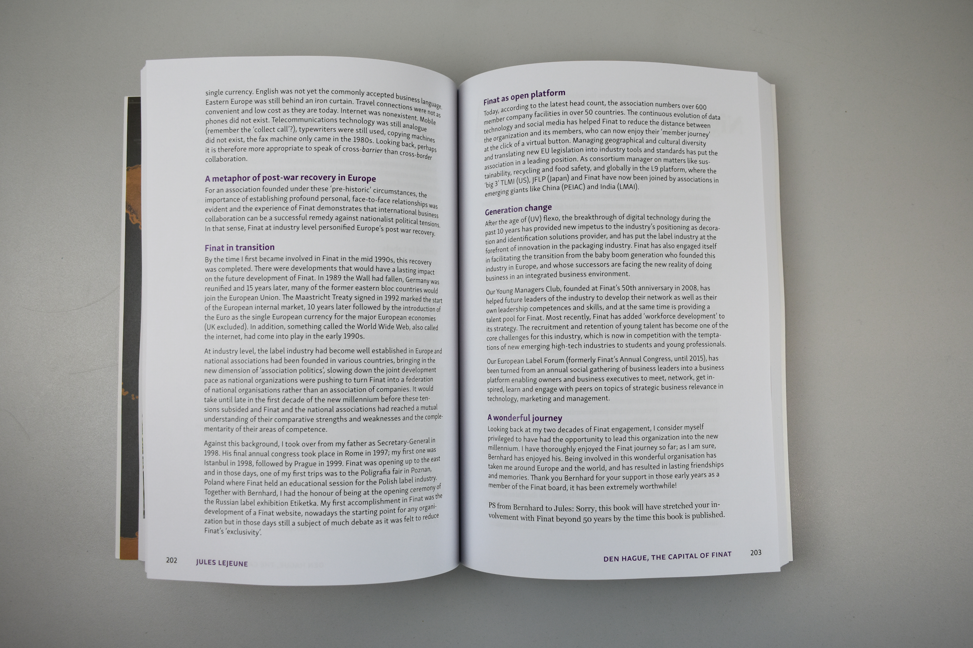
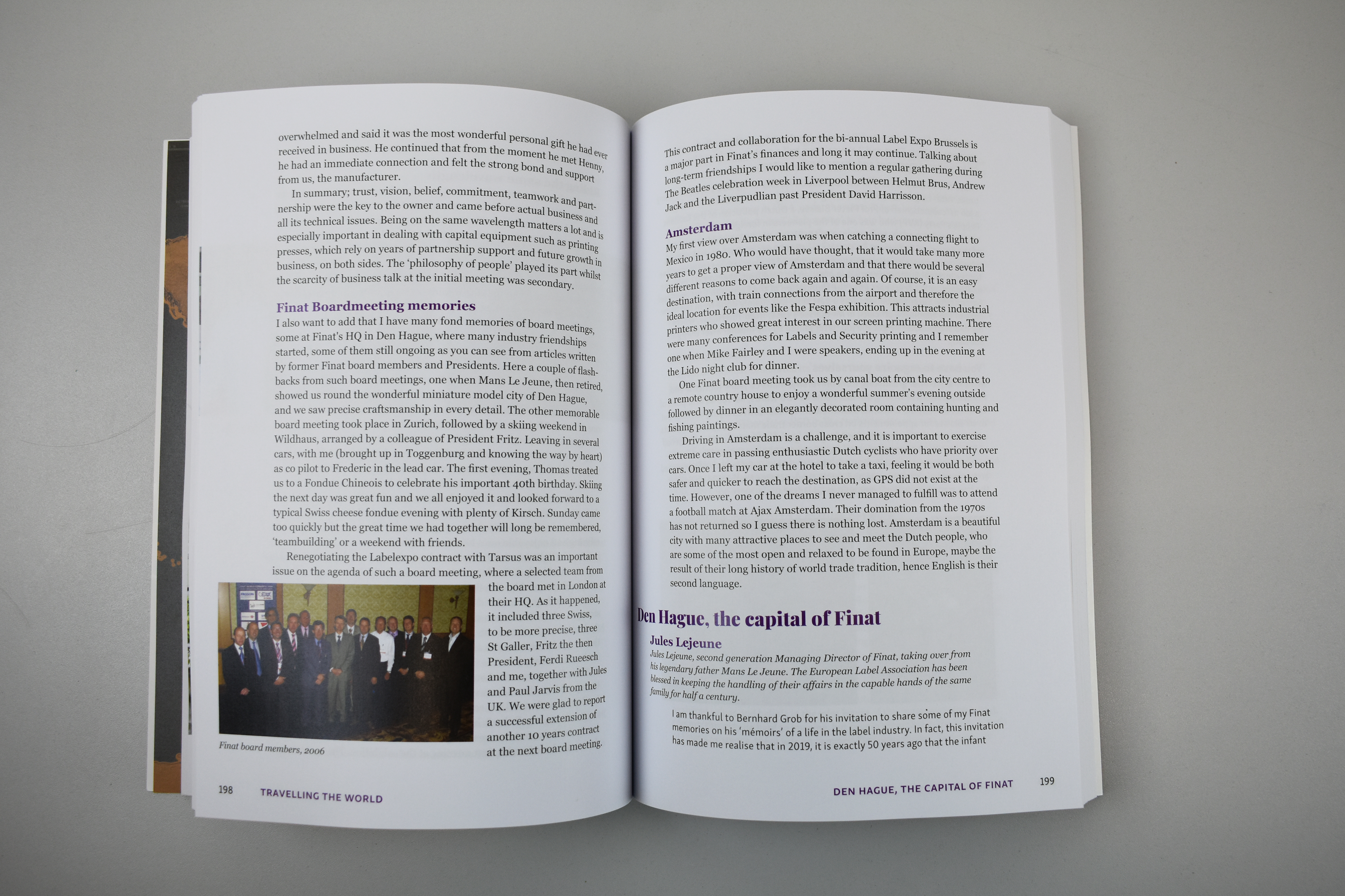
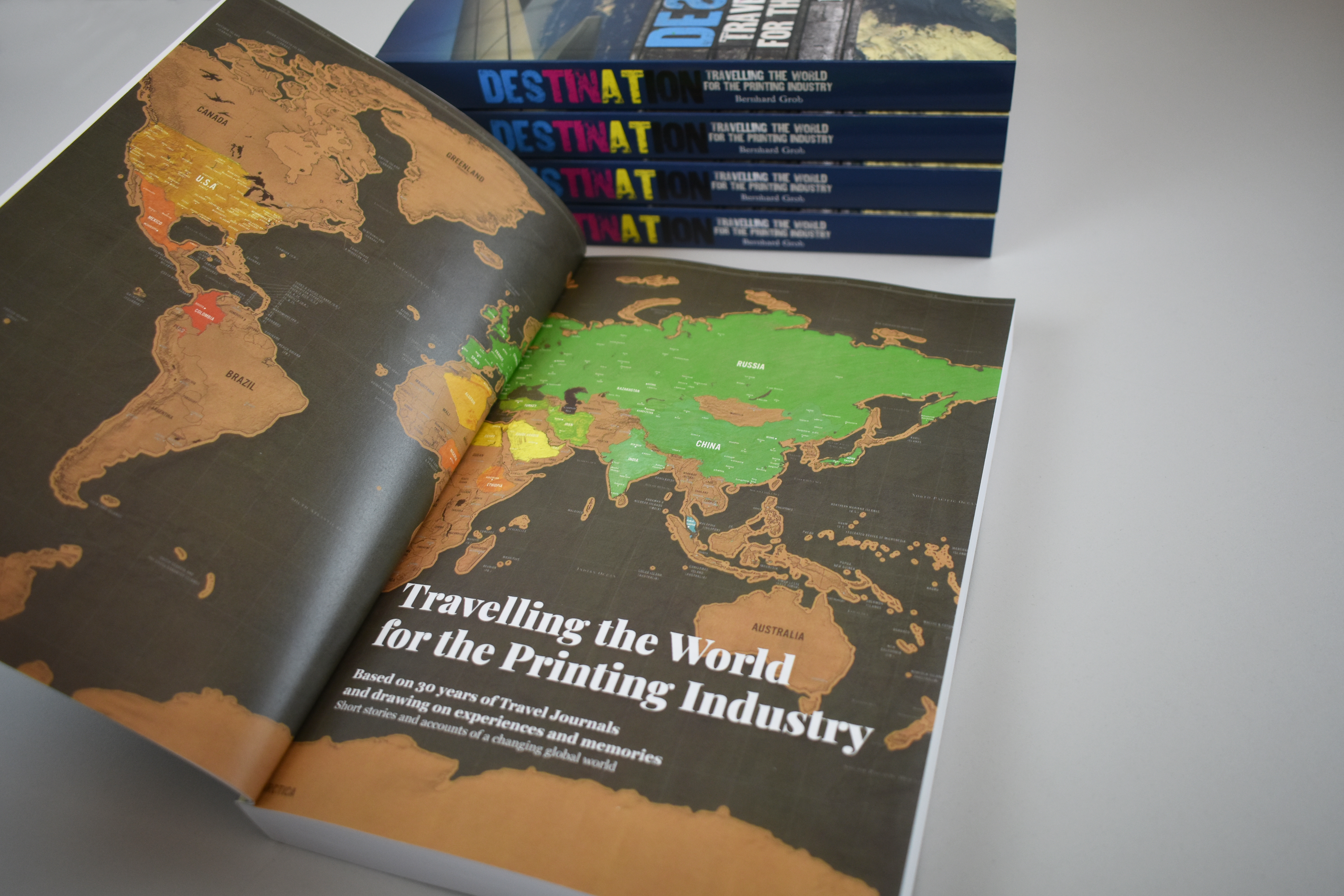
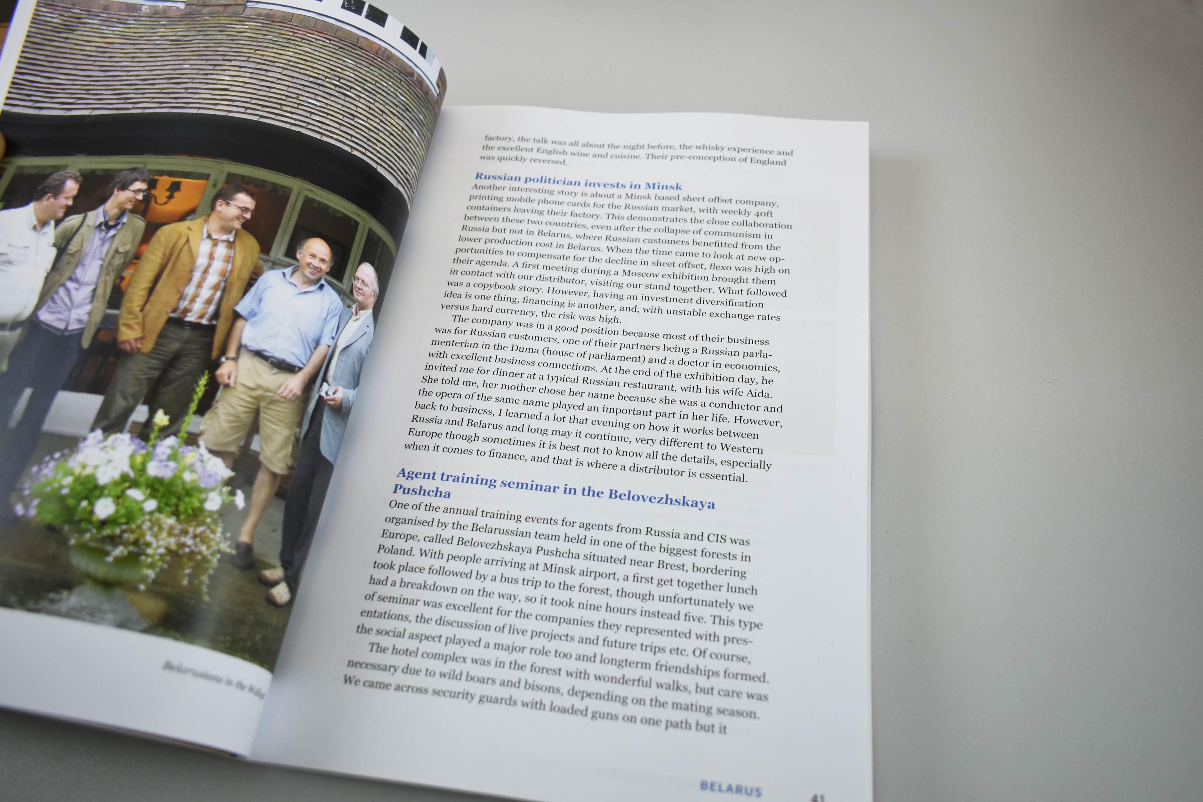
Final design // spreads from the final book which showcase the typographic hierarchy, colours, image treatment and use of travel stamps on chapter openers.