
Uni Project
For our editorial design module, we were tasked with creating, crafting and promoting our own printed magazine, based on a topic of our own choosing, ideally one that meets a gap in the market.
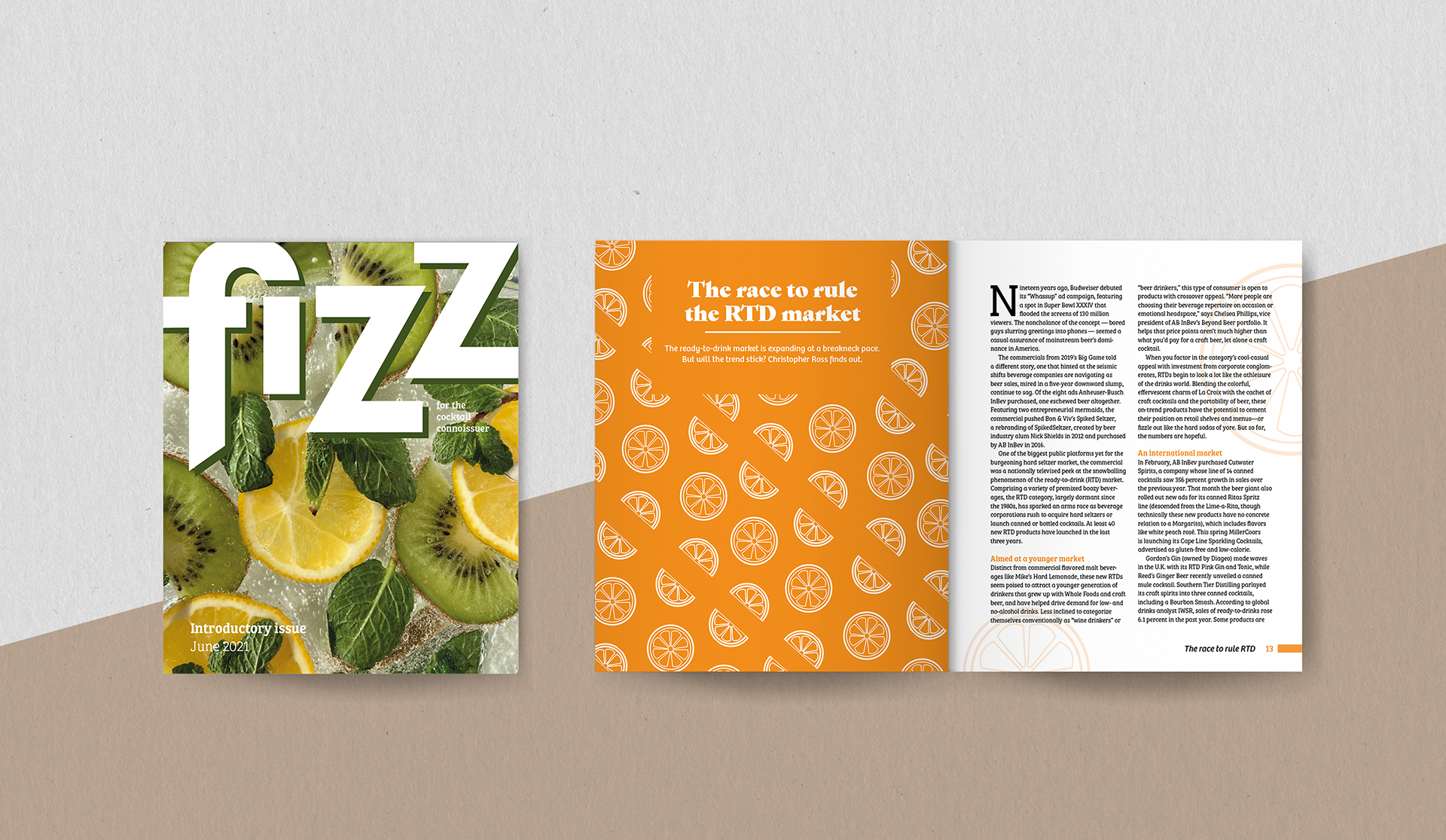
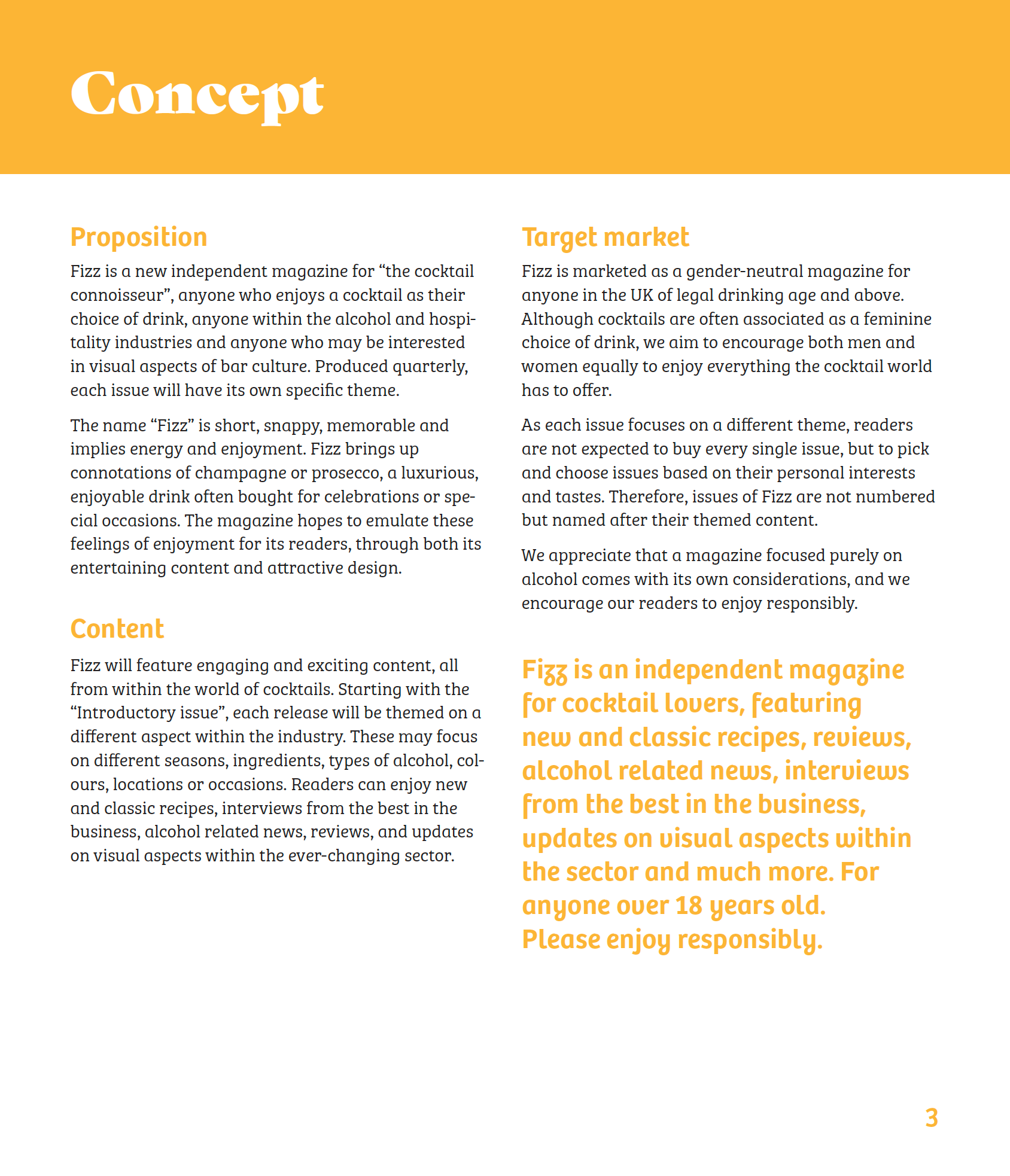
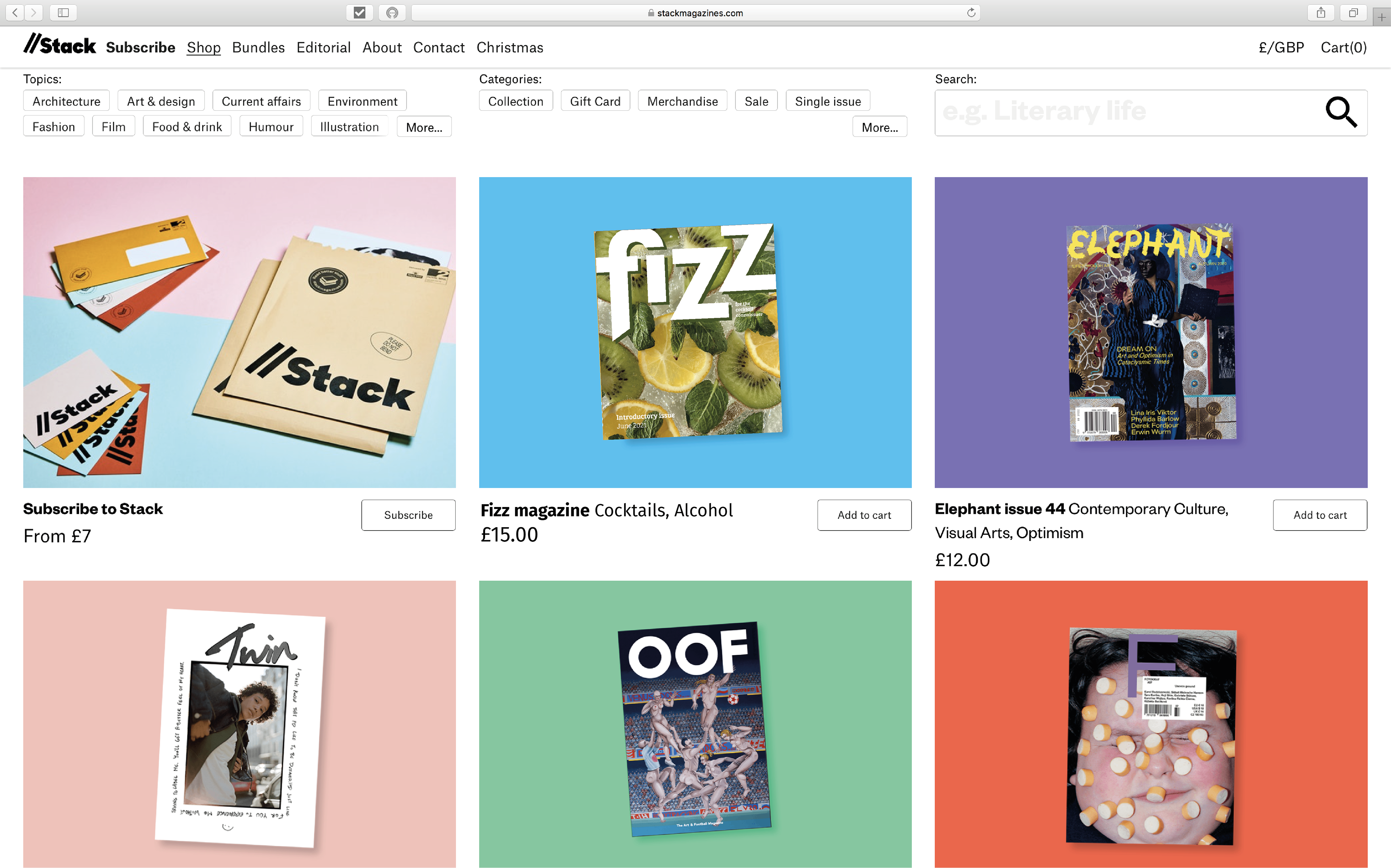
"Fizz" was born, a new independent magazine for cocktail lovers, featuring new and classic recipes, reviews, alcohol related news, interviews from the best in the business, updates on visual aspects within the sector and much more. For anyone over 18 years old to enjoy responsibly.
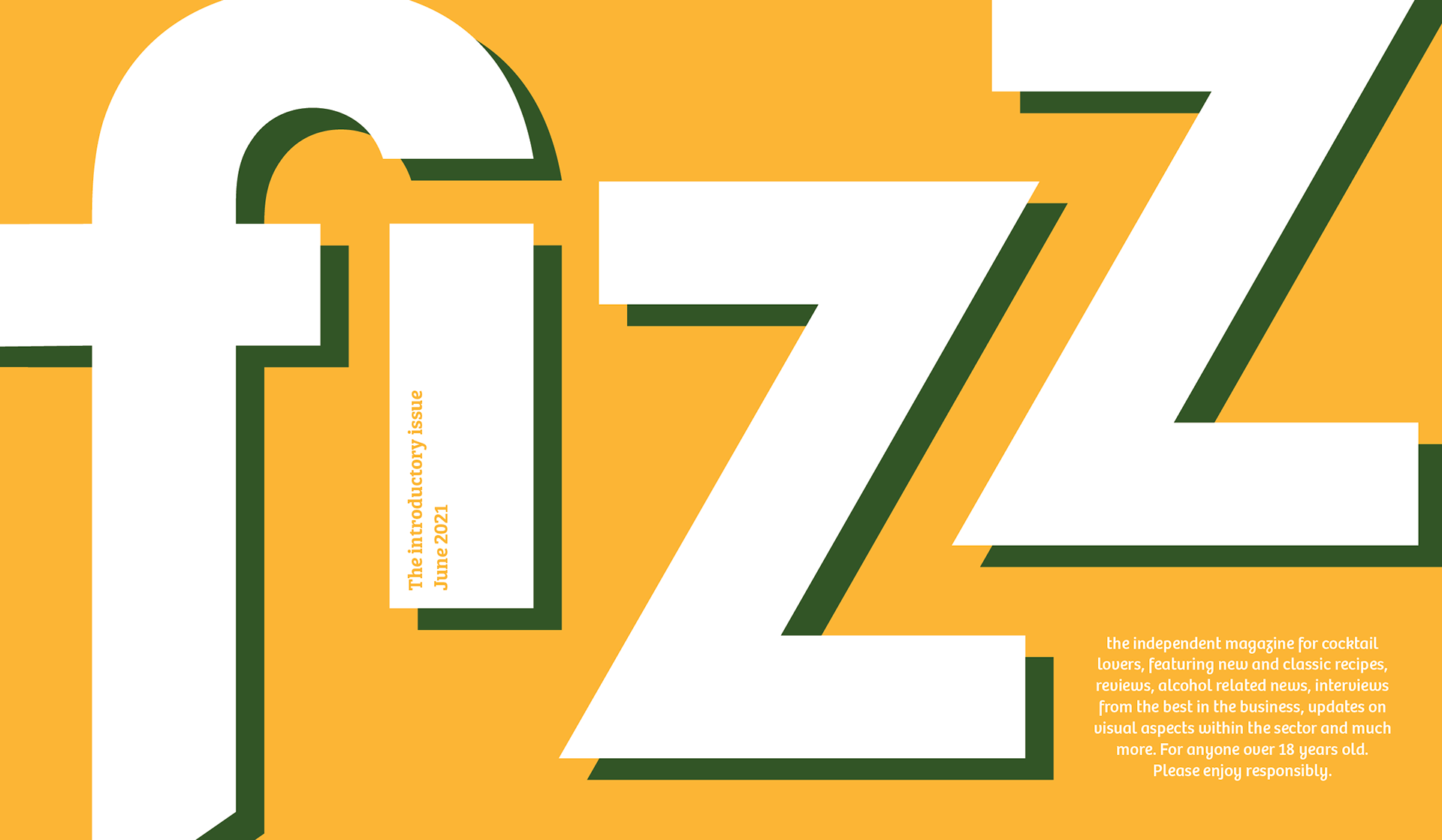
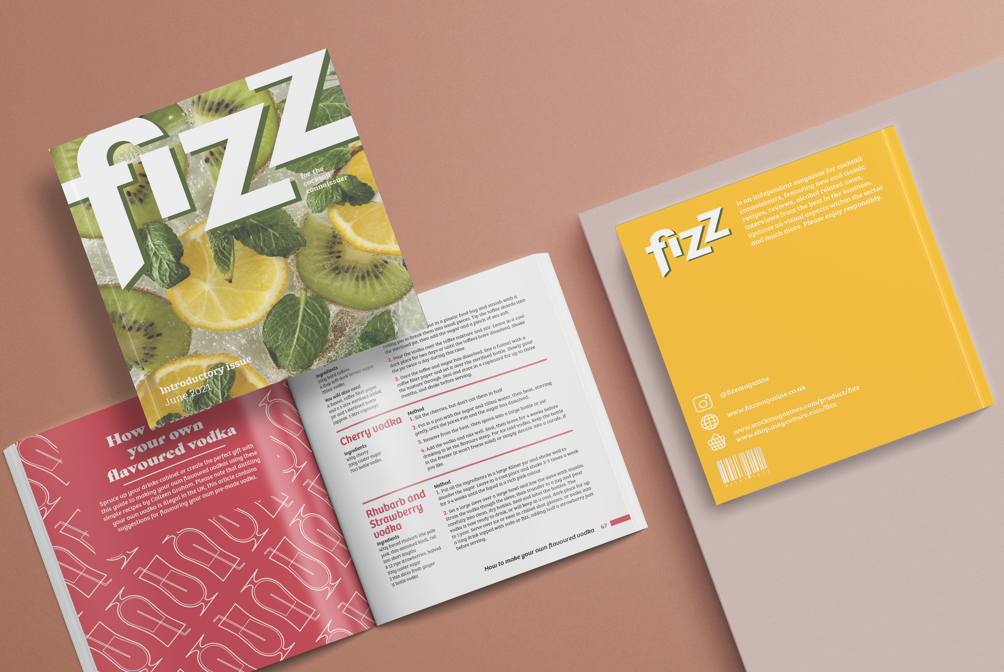
The name “Fizz” is short, snappy, memorable and implies energy and enjoyment. "Fizz" brings up connotations of champagne or prosecco, a luxurious, enjoyable drink often bought for celebrations or special occasions with the masthead designed to replicate the effect of bubbles floating upwards. The magazine hopes to emulate these feelings of enjoyment for its readers, through both its entertaining content and attractive design.
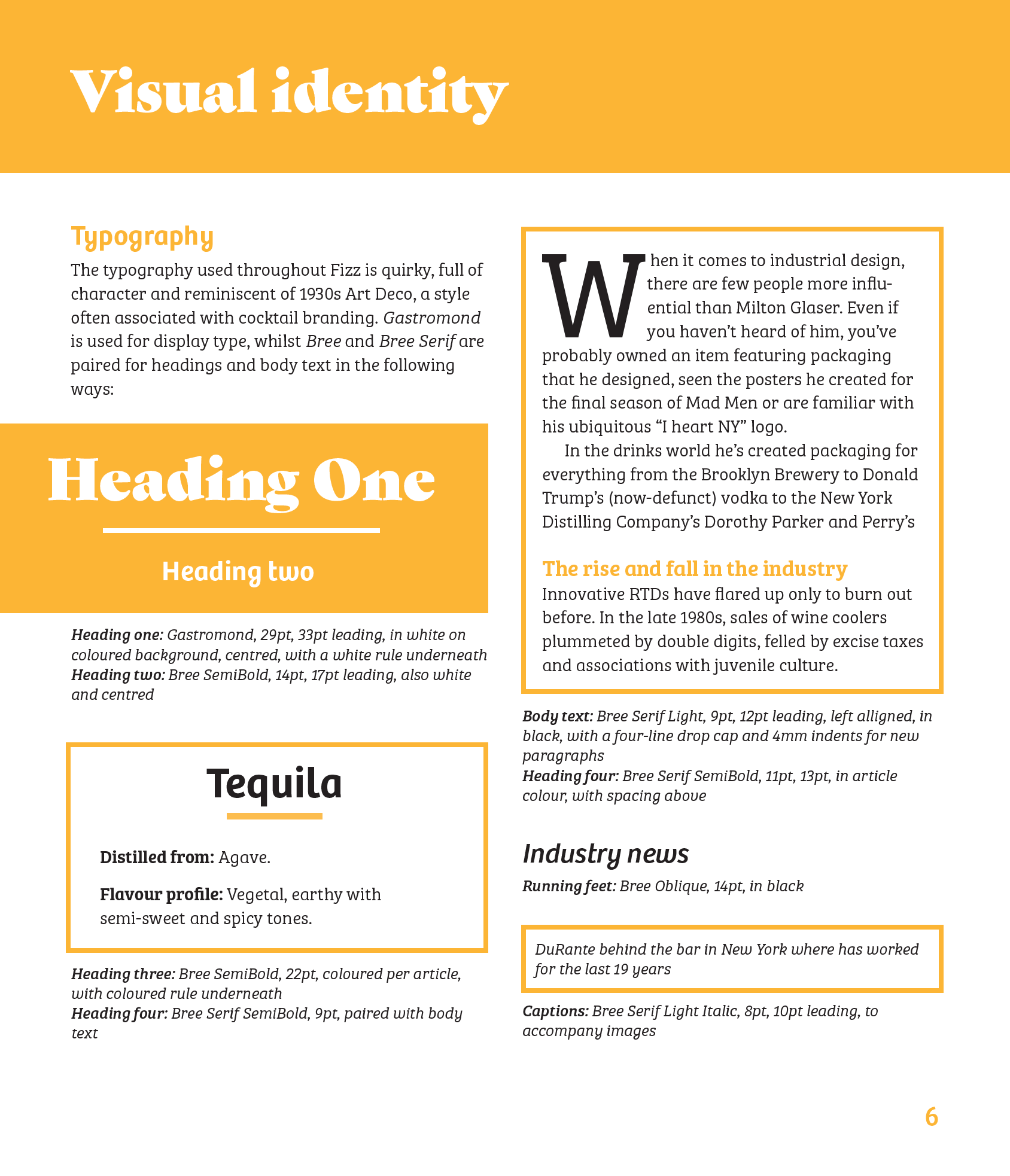
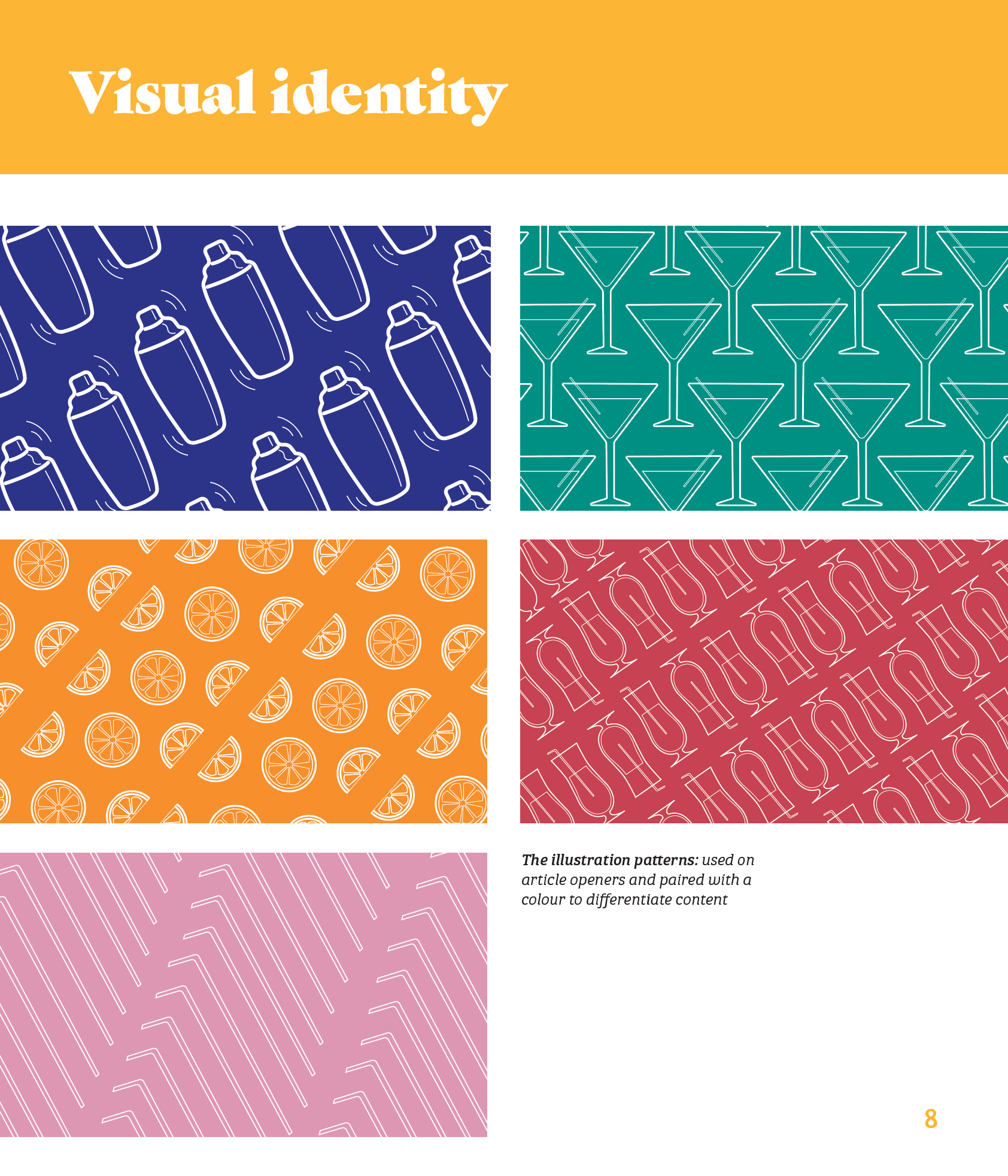
Featuring bright colours and engaging illustrations, the magazine is structured by its content, with navigation based on colour-coded sections, whilst the typography used throughout is quirky, full of character and reminiscent of 1930s Art Deco, a style often associated with cocktail branding.
"Fizz" is printed at 180mm (w) x 210mm (h) with a spine depth of 10mm. This almost square format is smaller than usual for the magazine industry, however, this makes "Fizz" stand out from its competitors and adds to the friendly, approachable feel that the brand aims to achieve. The inside pages have a slightly glossy finish which is both practical (if the reader enjoys a drink whilst readings) and adds to the premium feel of the magazine. The cover features a subtle pearlescent finish and the magazine is kettle stitch bound to allow it to lie flat.
This project was really fun to work on as I was able to choose my own content and matching style, further securing my interest in editorial design. As a magazine, the brief was less restrictive than other editorial projects which allowed for more experimentation of graphic elements such as the use of illustrations and coloured rules.
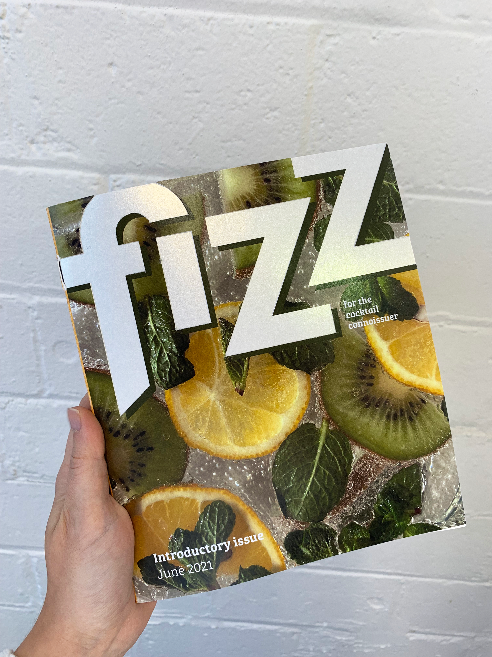
Cover // the physical copy of Fizz.
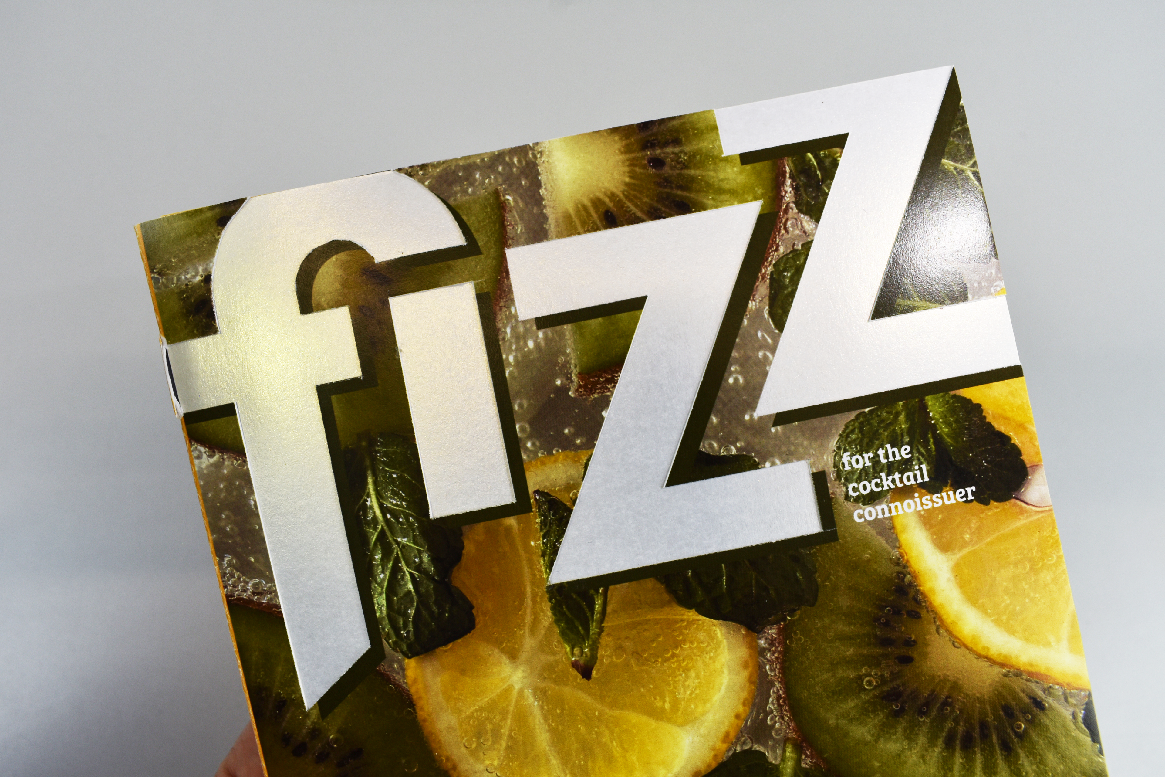
Cover // the masthead features a pearlescent finish.
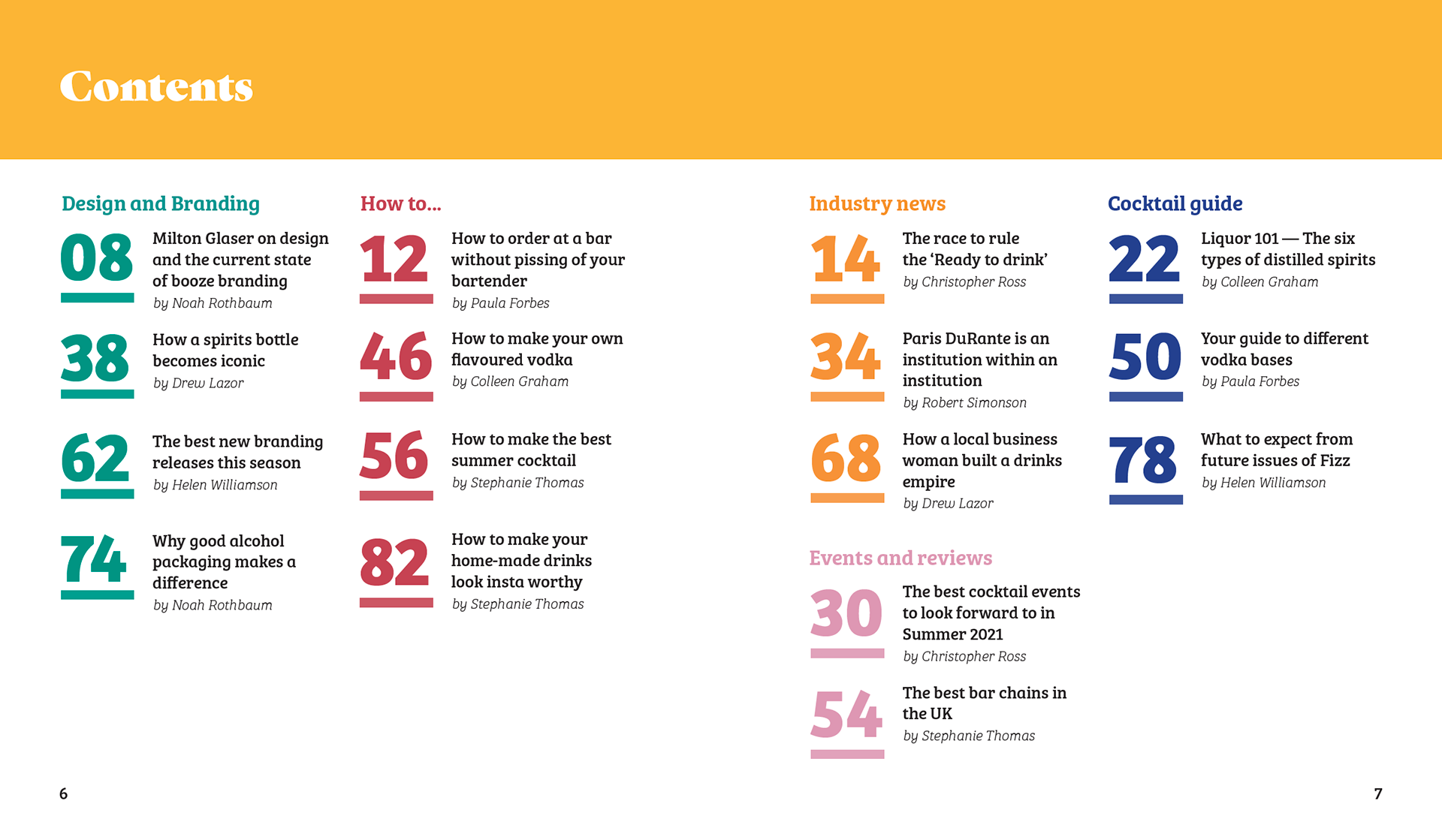
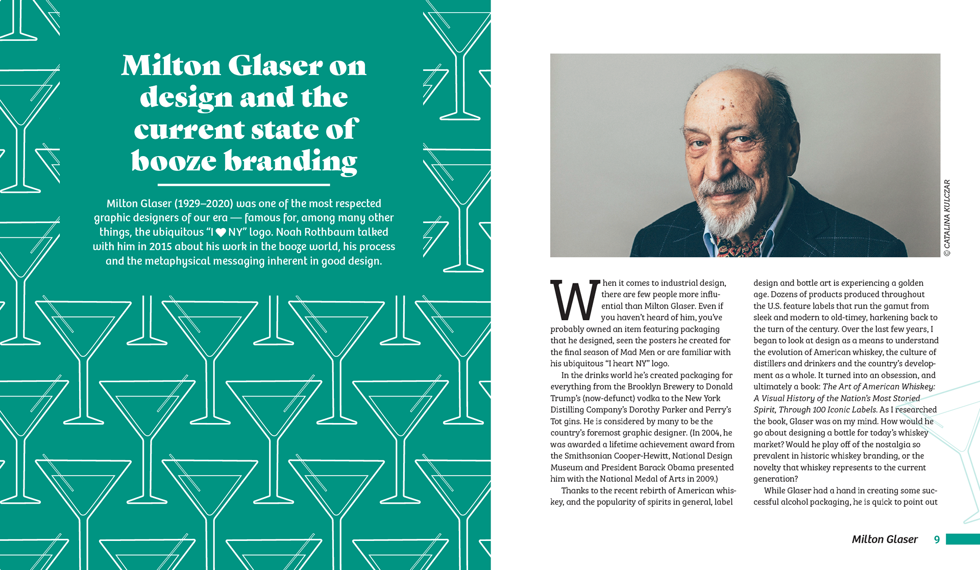
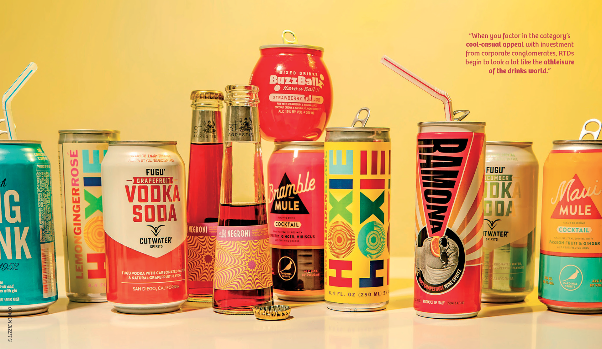
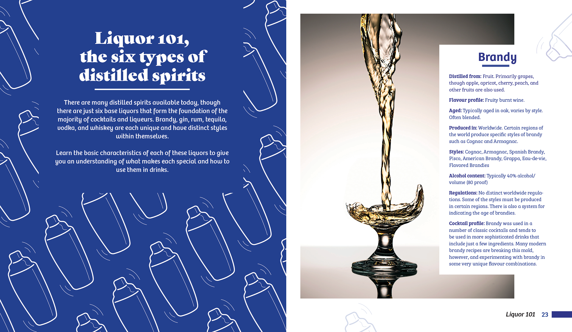
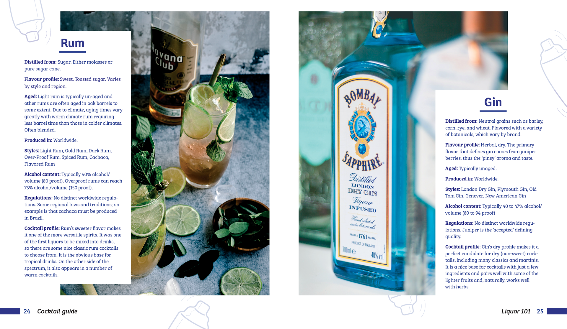
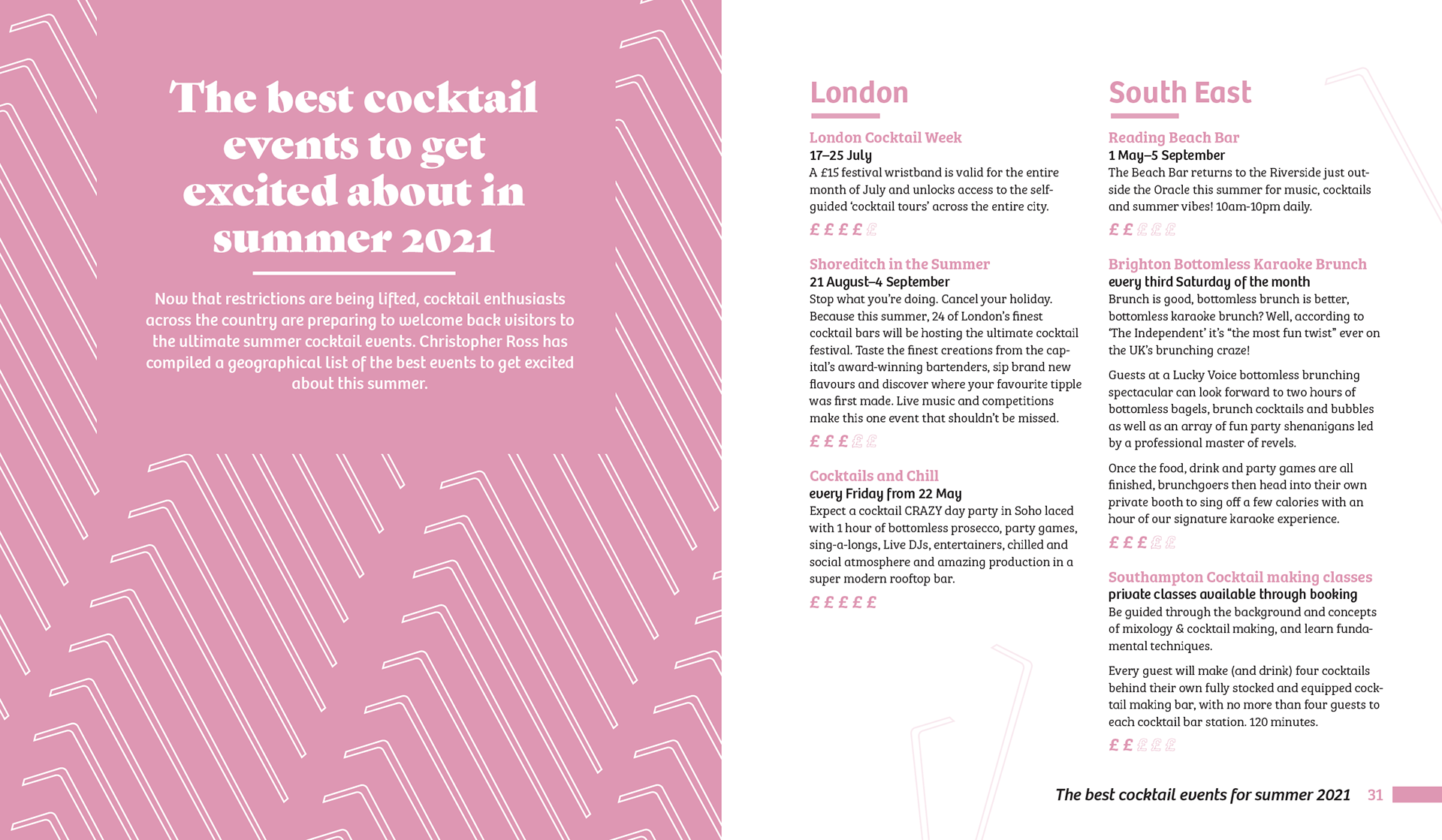
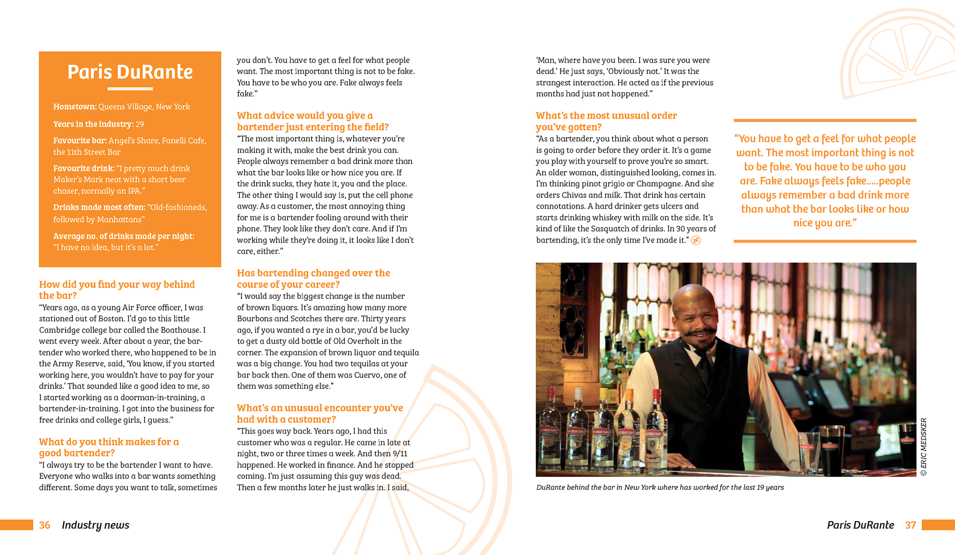

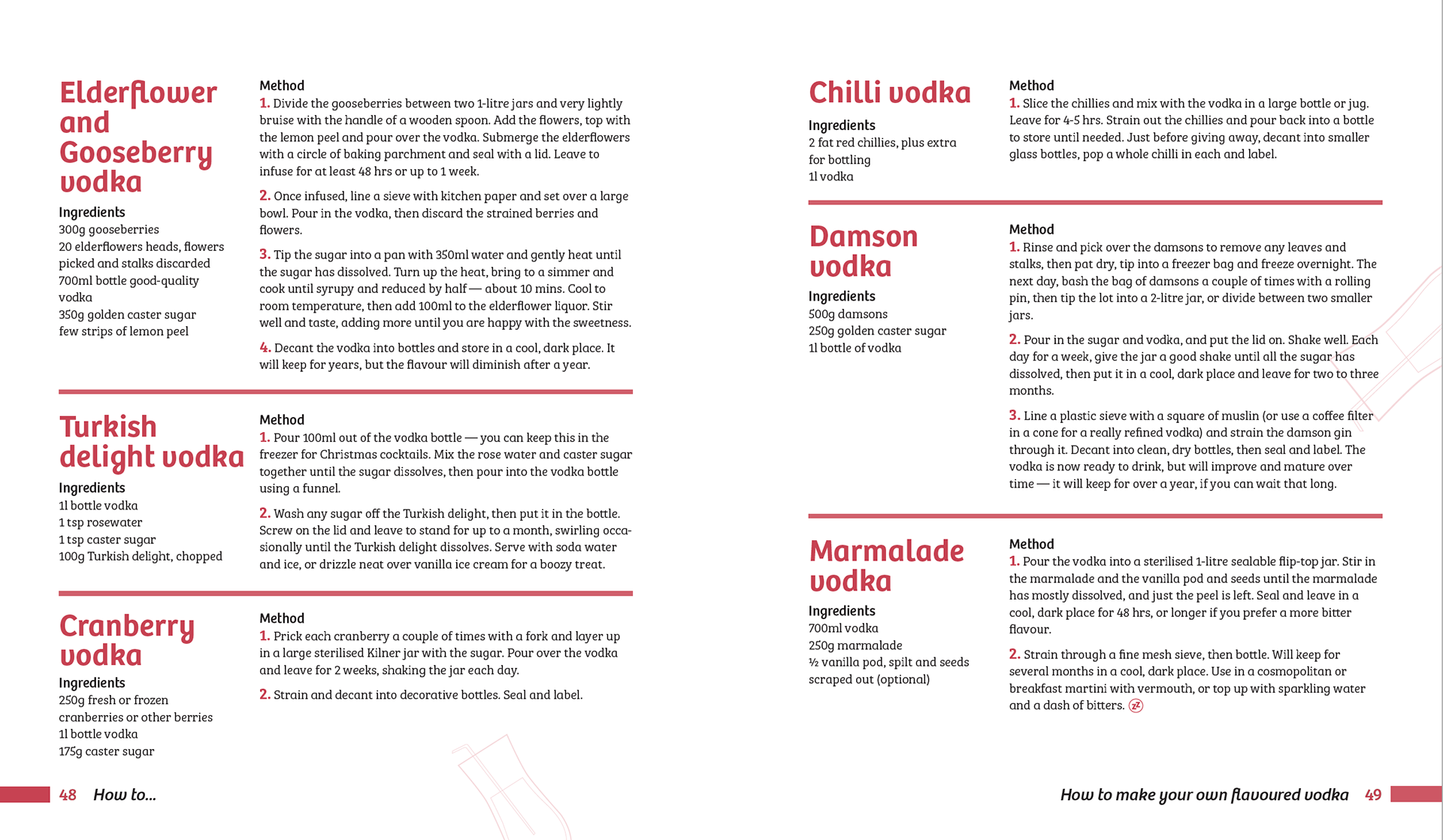
Design // some of the inside spreads.
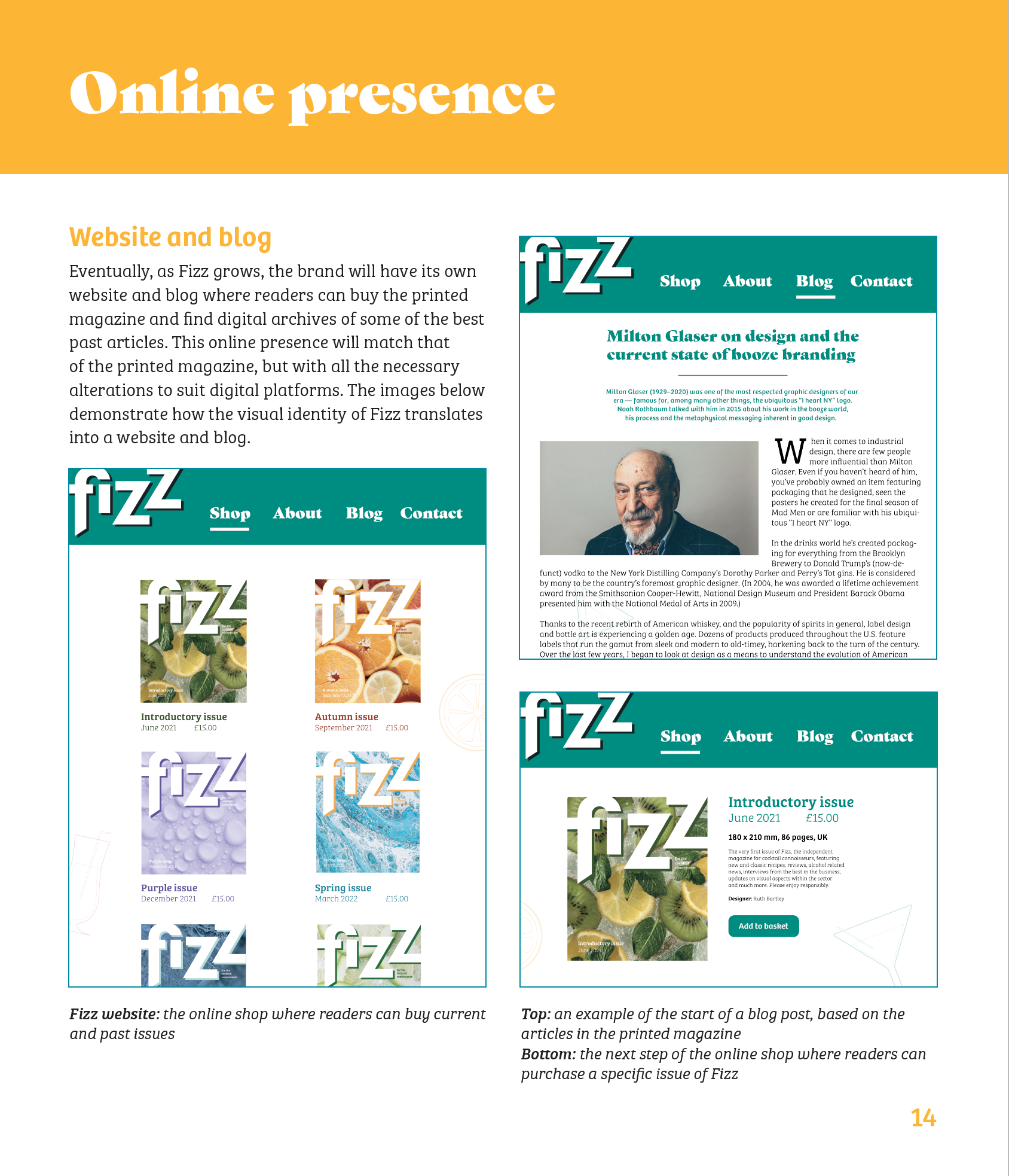
Proposal // pages from the accompanying 'Magazine proposal' document, pitching the concept of Fizz, showcasing its design elements and demonstrating its online presence.
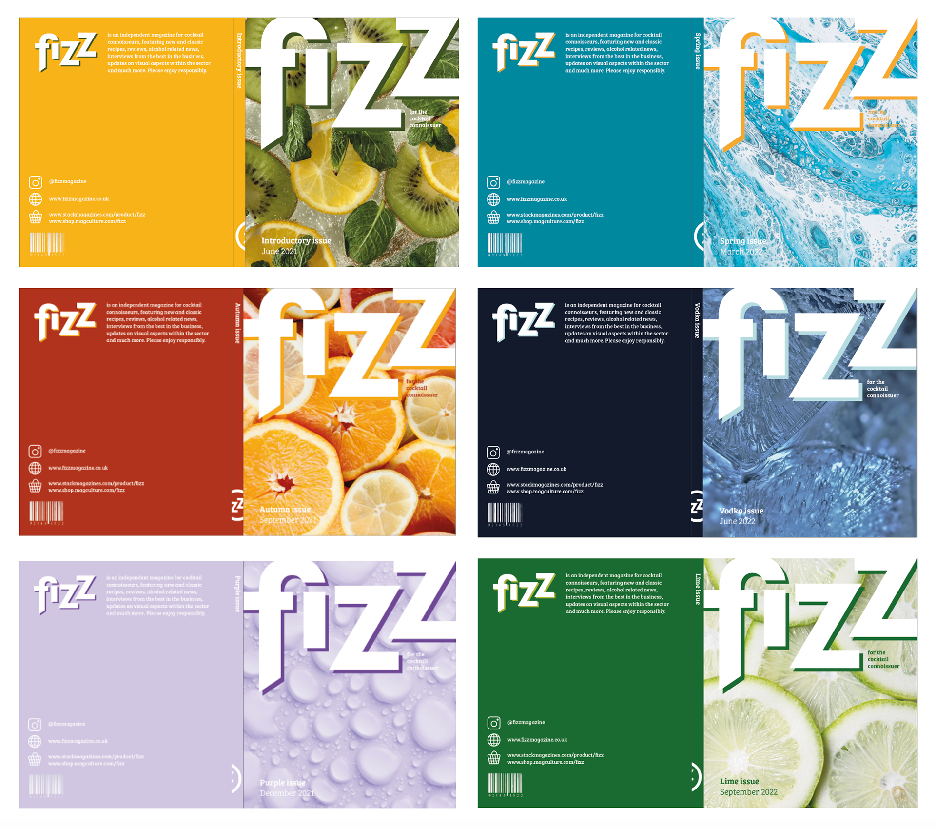
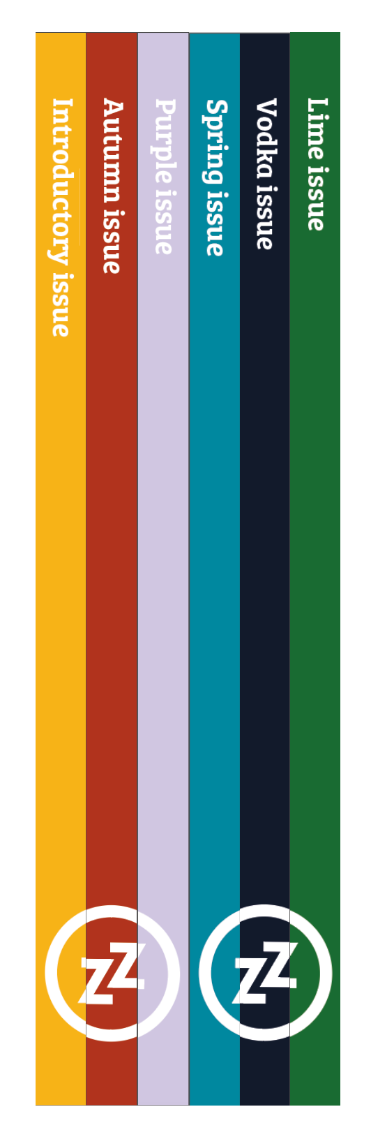
Series design // various future issues of Fizz, with cover images based on the content theme, paired with a highlighted colour on the back. The spines work together to form the double-z icon, encouraging readers to buy every issue.
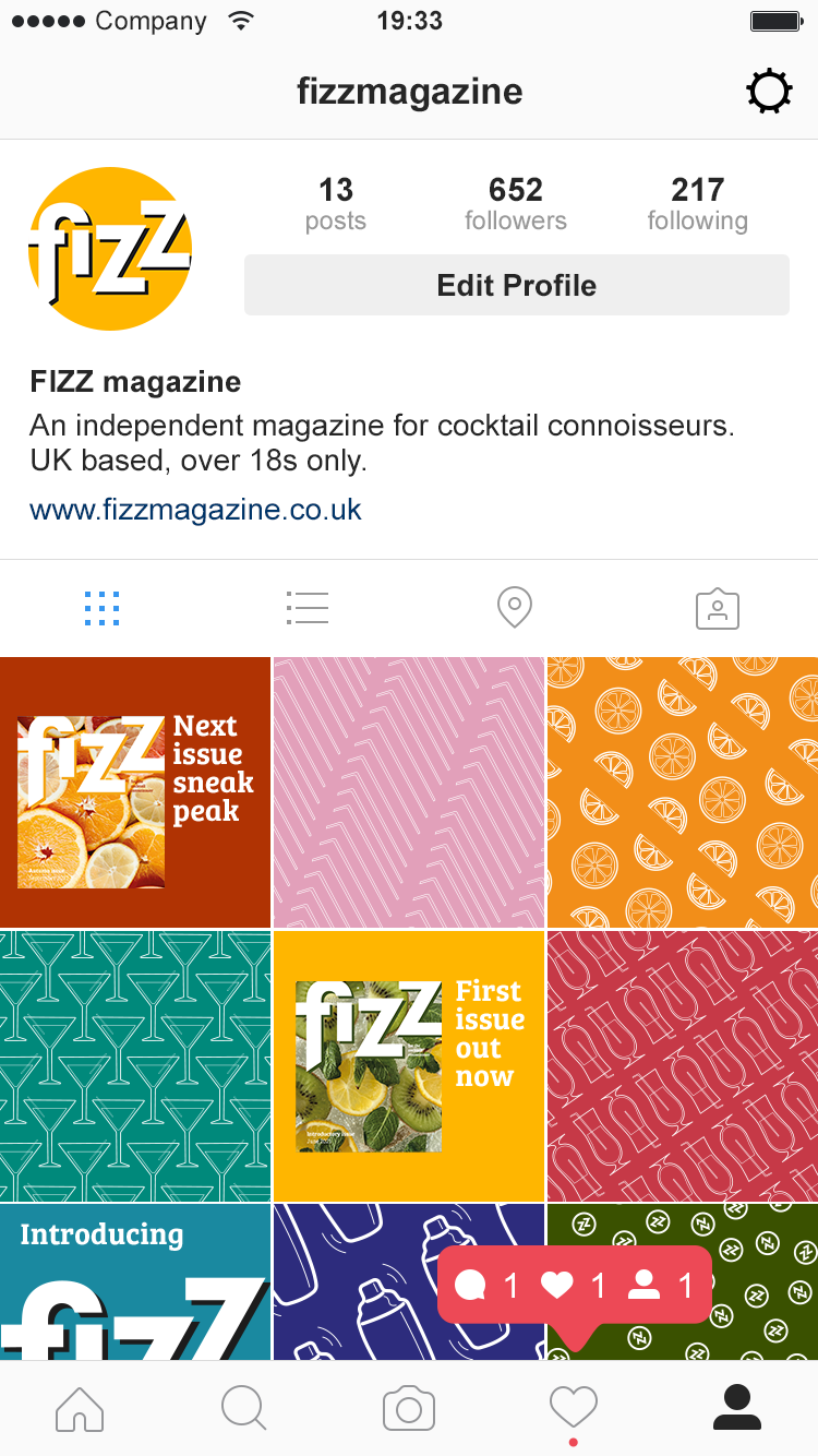
Online presence // social media and how Fizz would appear at online stockists.