Copyright of Stills
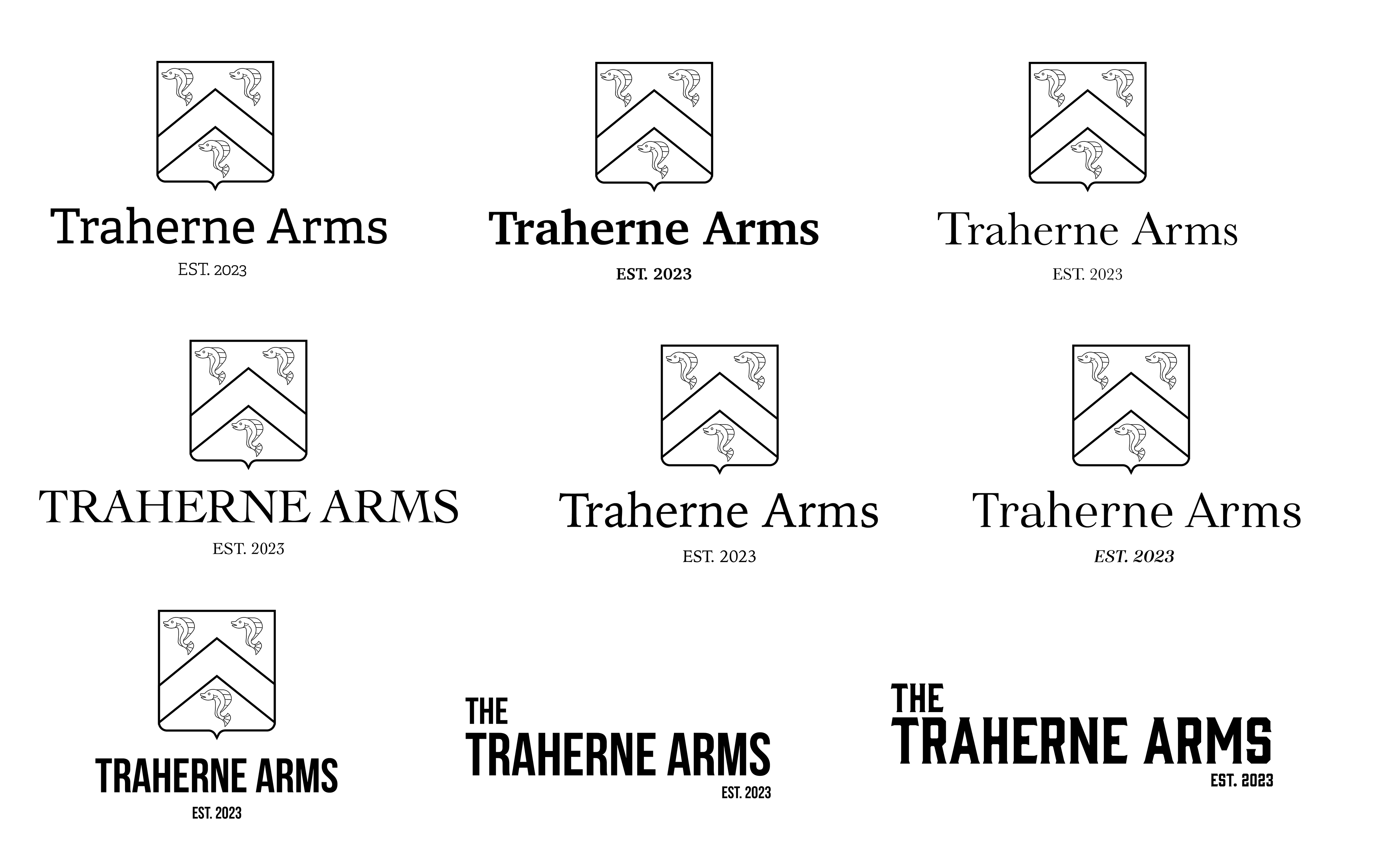
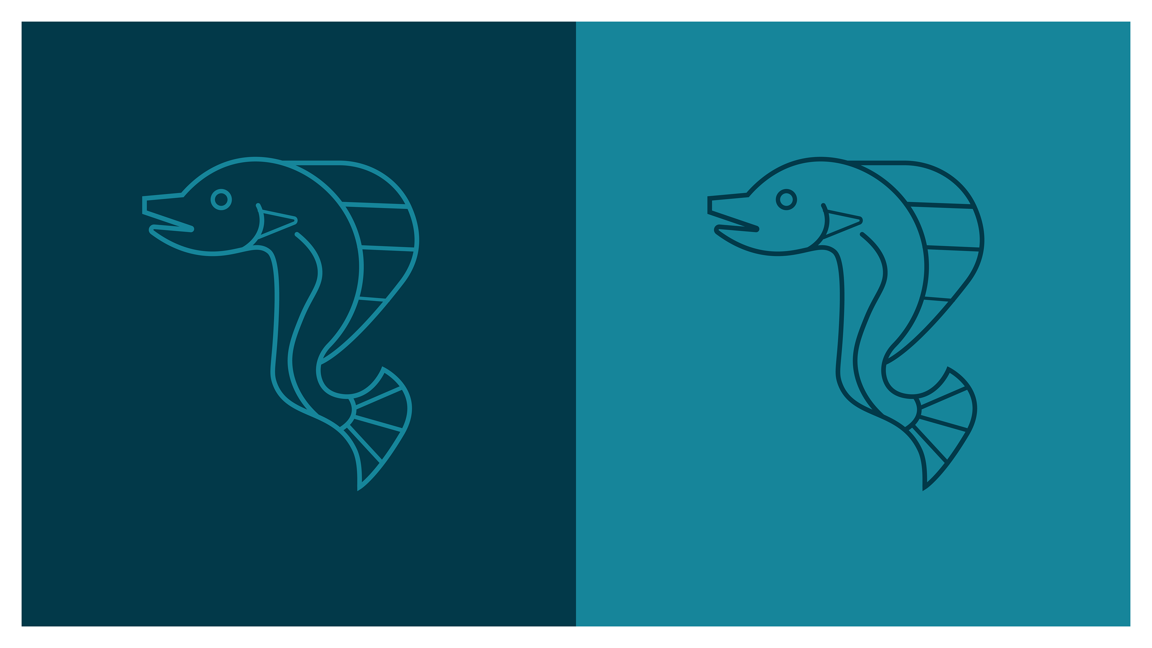
Although this project was not taken forward by the client, I came up with the following design options for the logomark and colour palette for The Traherne Arms, a historical roadside pub near Culverhouse Cross, Cardiff. It was fun to play around with the emblem style badge, based on historic family shields (the fish on the Traherne family sheild becoming a key focal point) but with a modernised twist.
The project was halted due to client delays and the pub has still not re-opened so this work is purely speculative and not officially associated with the Traherne Arms if it does open in the future.
Design inspo provided by the client
Design exploration and development
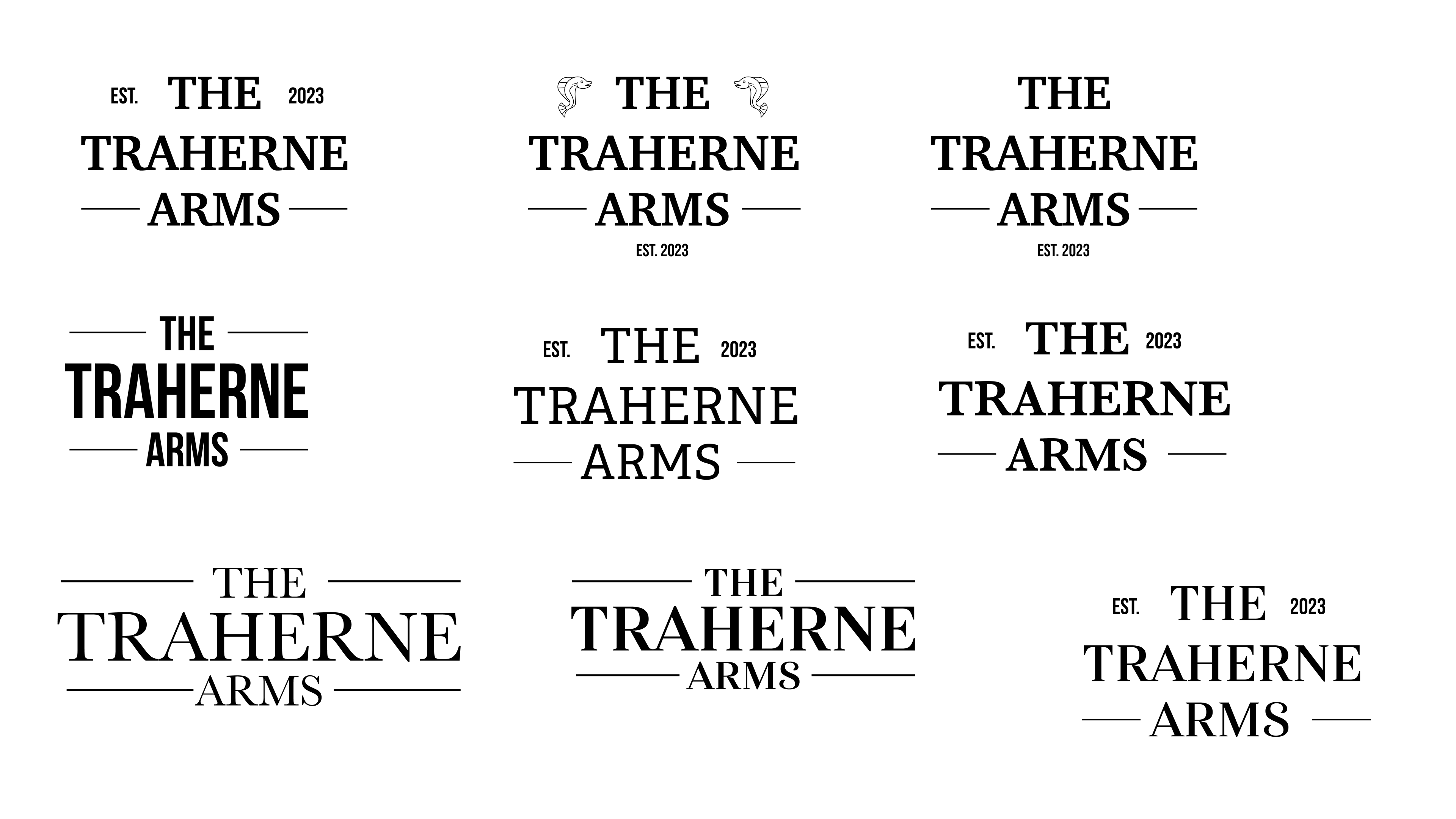
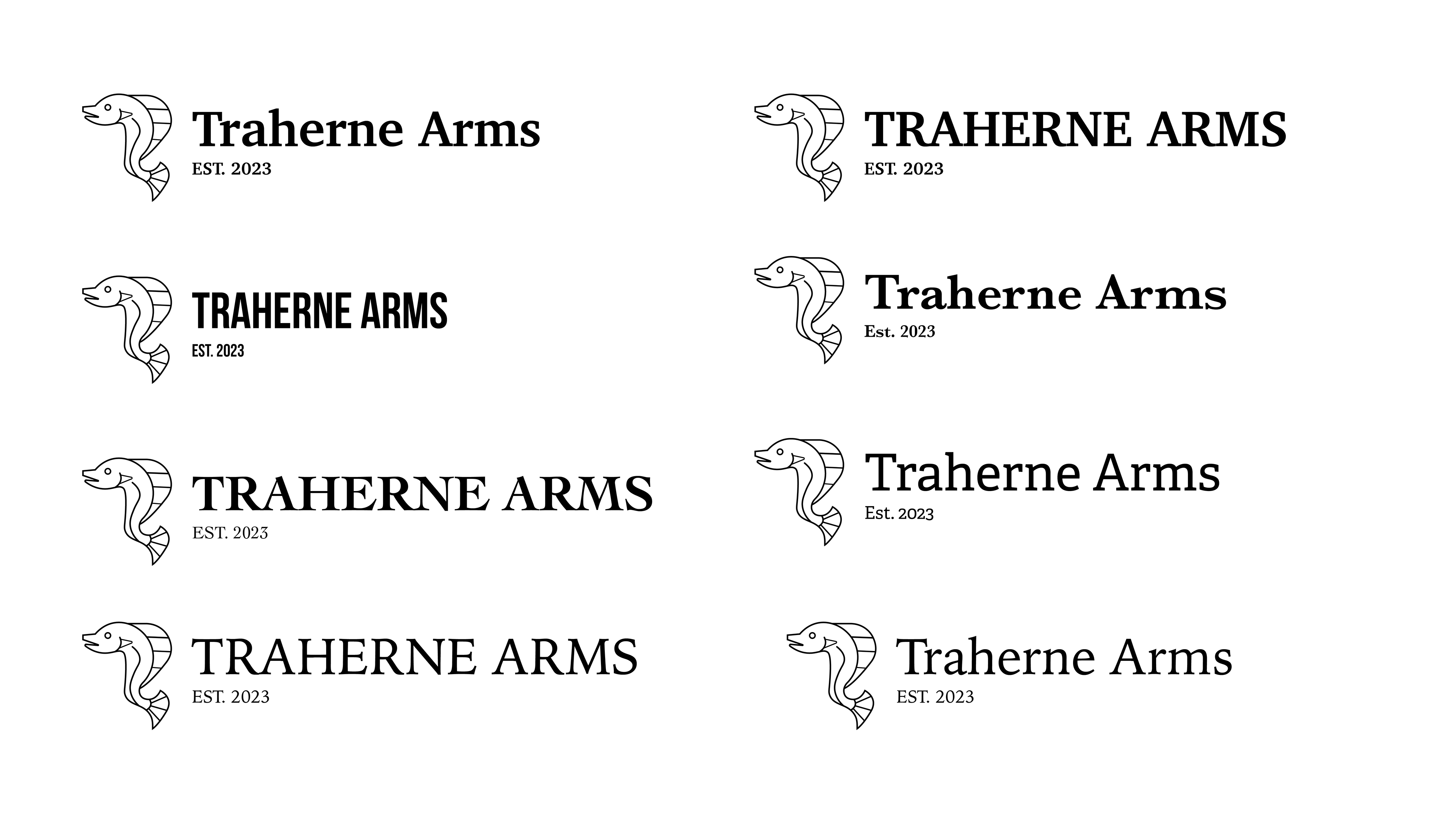
The below images show the various design options that were part forward as part of this brief, exploring colour combinations, emblem design, typography and layout.
The chosen design to be taken forward (when ready) was the simplified white shield on the darker blue background with the name displayed underneath, the first image shown below.



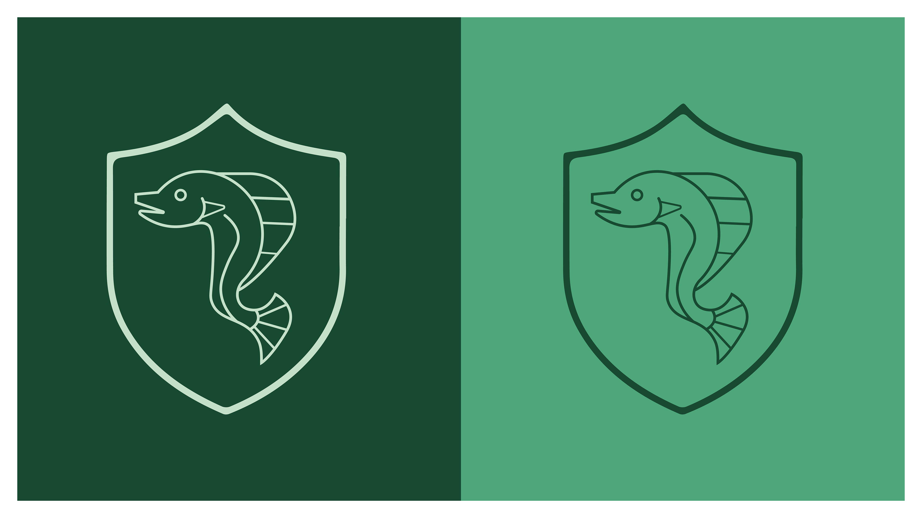

Design variations of the shield emblem mark that were explored as different options
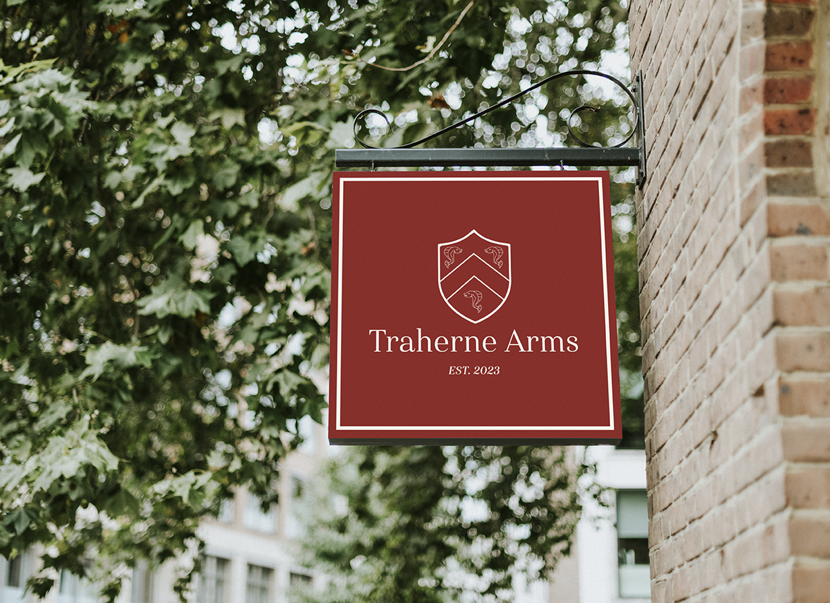
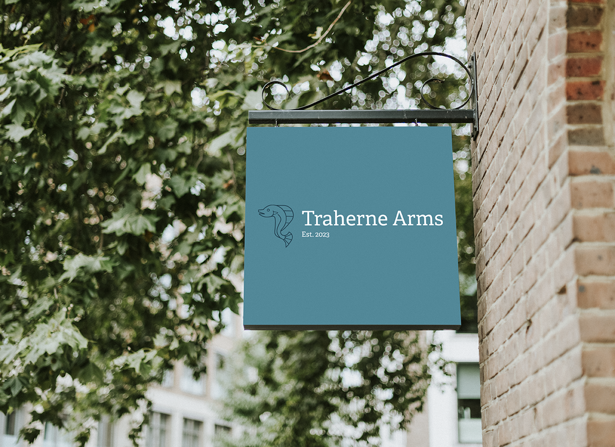
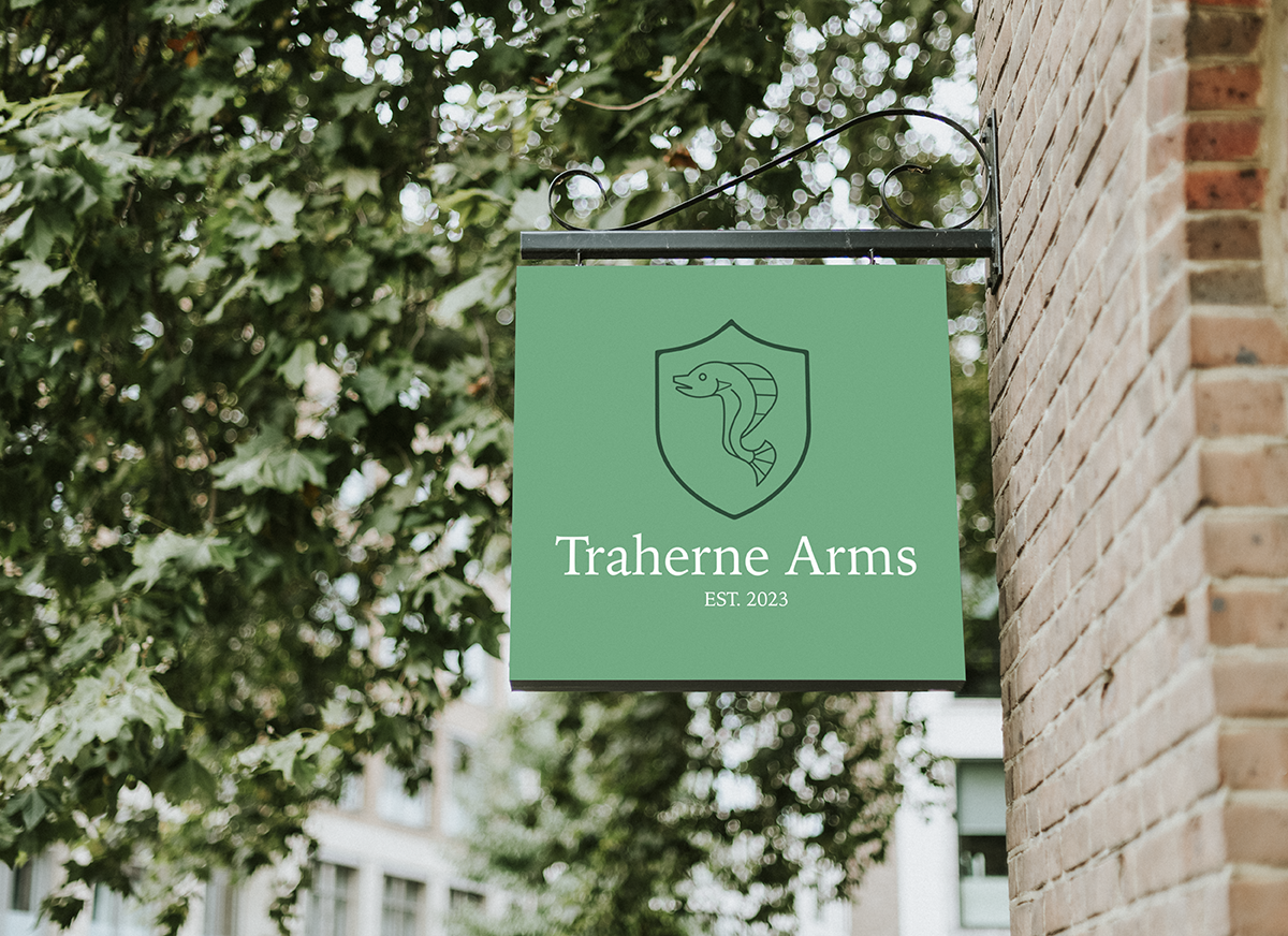
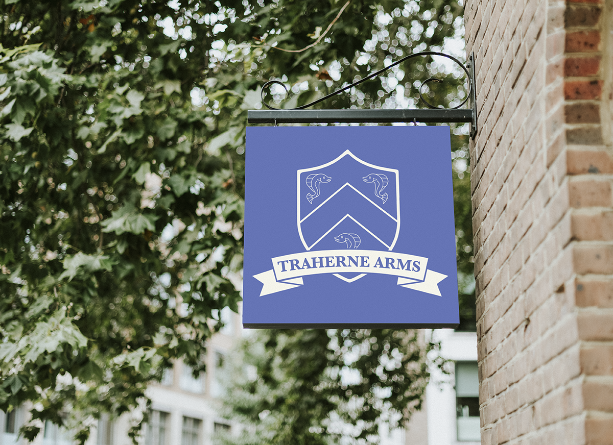
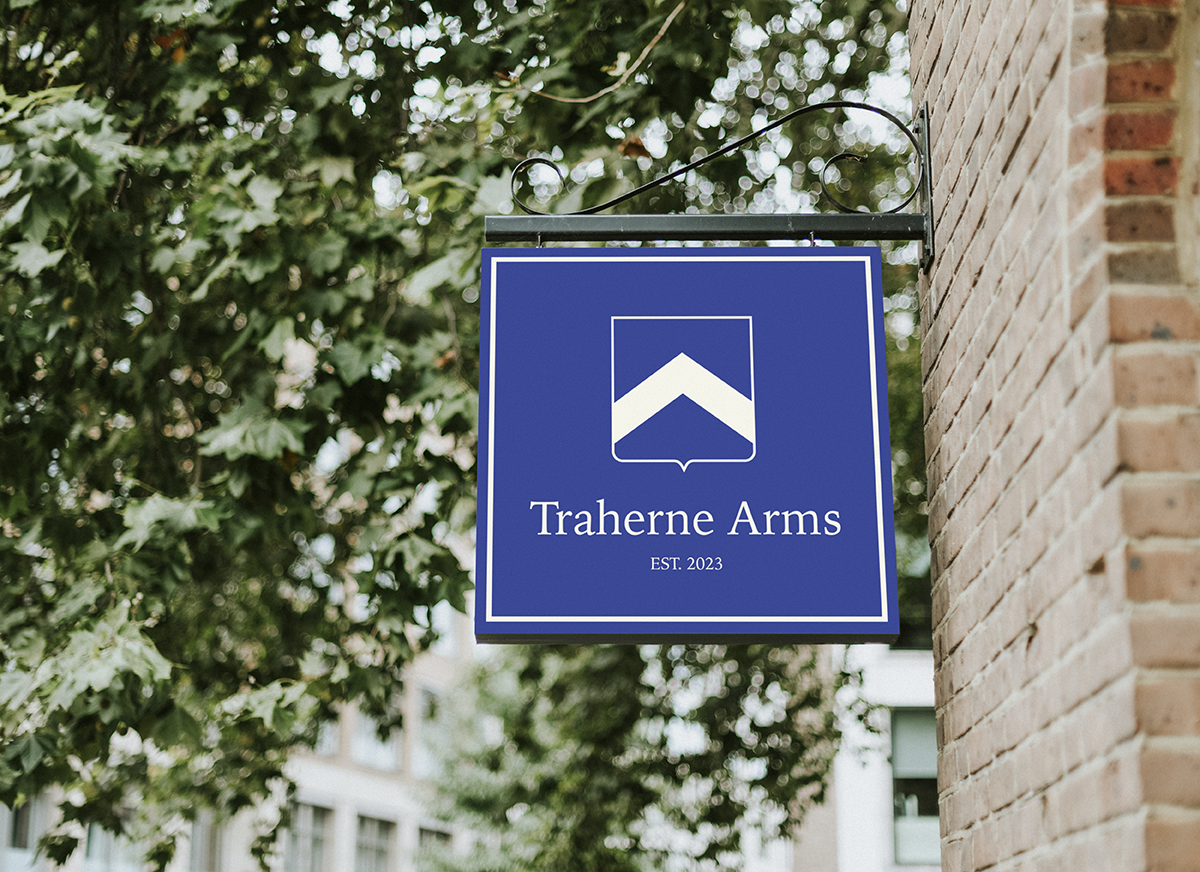

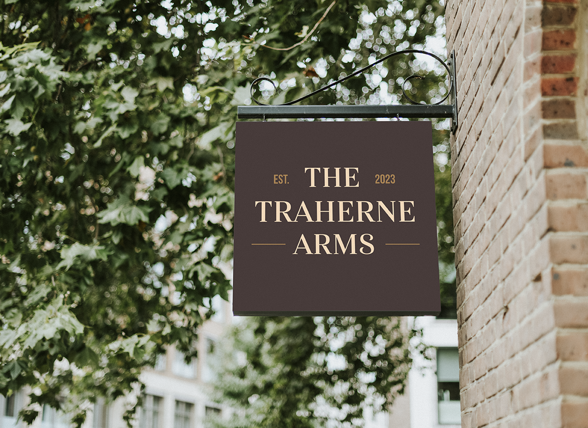
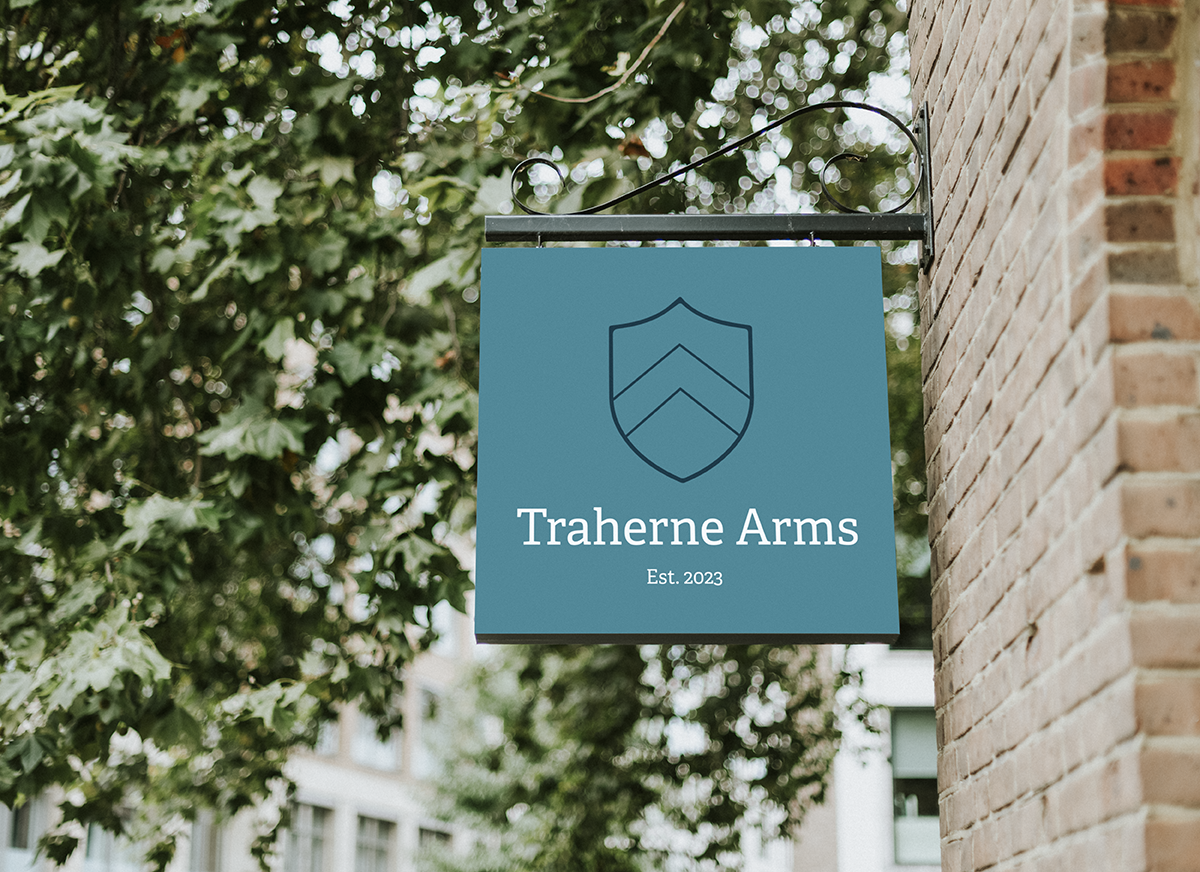
Mock ups of the logomarks on a pub sign to assess scalability, legibility and colour contrast
